Tutorials
- USER GUIDES & VIDEO TUTORIALS
- ALL VIDEO TUTORIALS
- OVERVIEW
- ASSETS
- CREATE COURSE
- Getting Started with Creating Courses
- Create Course - Course Settings
- Course Builder (TOC)
- Build Lessons
- Lesson Settings
- Lesson Page Navigation
- Lesson Editor Overview
- Lesson Editor - File Options
- Add Content - Tools: Assets
- Add Content- Tools: Page Elements
- Add Content - Page Templates
- Add Content - Layout Templates
- Save As a Row, Column, Tool As a Template
- Tool Settings
- Row Effects
- MANAGE COURSES
- MANAGE TEMPLATES
- MANAGE XAPI
- ADMIN
- ACCOUNT
Add Content – Layout Templates
Table of Contents
LAYOUT
ROWS: OVERVIEW
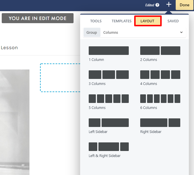
Rows and columns are the building blocks of your lesson layouts, allowing you to easily add and organize content on your pages. Rows are the horizontal blocks in which columns are housed. These can be added by adding any column to your lesson page from the Add Content menu (+ icon in the top right corner) on the Lesson Editor:
- Save an individual row as a template, for use in another course or lesson. See the Save As section
- Set a distinct background image, video, or color for a specific row.
- Have flexibility in rearranging your content on your layout.
- Set unique margin/padding settings for a specific row.
ROWS: SETTINGS
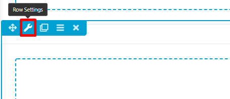
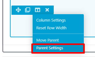
Row settings can be easily managed using the tool icons in the top left of each row:
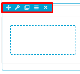
- Move your row
- Access the row settings
- Duplicate your row
- Reset column/row widths
- Delete your row
- Style
- Advanced
STYLE TAB
The Style tab on the row’s settings panel offers the following options:- Width: Select to make your row width full width or fixed.
- If selecting fixed width, you will need to select a maximum fixed width. This will define how narrow the row can become as the device screen size gets smaller than the max width (but can’t get wider as the screen size increases).
- If selecting full width, you will need to select whether or not to make your content width fixed or full width.
- Height: Adjust the height of your row.
- Colors > Text Color: Set a text color for any text in your row.
- Colors > Link Color: Set a link color for any links in your row.
- Colors > Link Hover Color: Set a color for when hovering over any links.
- Colors > Heading Color: Set a color for any headings in your row.
- Background > Type: Select the background type for your row. By default, this is set to None, but can be changed to Color, Gradient, Photo, Video, Embedded Code, Slideshow, Parallax.
- Border: Select the color and width of the border, or adjust its radius and shadow.
- Top Shape > Shape : Select a top shape for your row. By default, this is set to None but can be changed to Slanted Edge, Waves, Midpoint, Triangle, Circle, Concave, Spots, Topography.
- Bottom Shape > Shape: Select a bottom shape for your row. By default, this is set to None but can be changed to Slanted Edge, Waves, Midpoint, Triangle, Circle, Concave, Spots, Topography.
- Shape Container > Clip Within Container: By default, this is set to No Clip, but can be adjusted to Clip Contents if you wish to clip your row content.
ADVANCED TAB
When adding a row, the Advanced tab has the following options: Spacing, Visibility, Animation, HTML Elements, and Export/Import: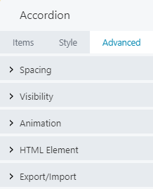
 When uploading most assets, the Advanced tab will remain the same. To learn more about the advanced options, visit the Advanced Tab section.
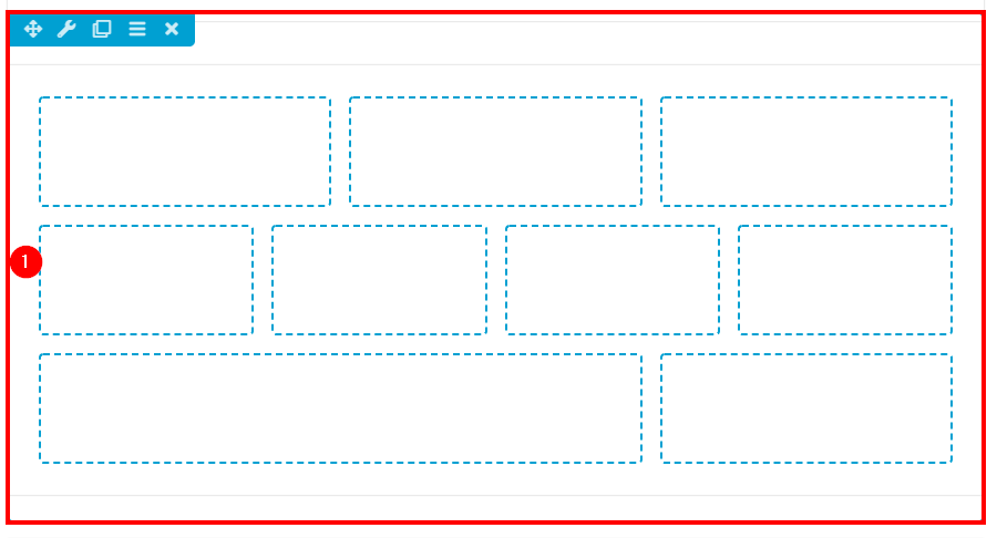
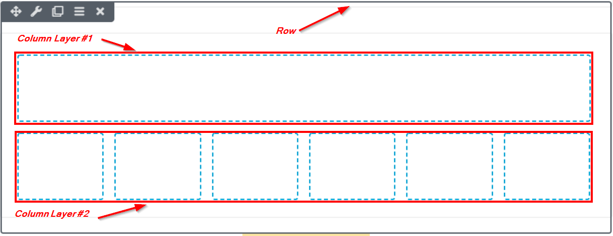
COLUMNS: OVERVIEW
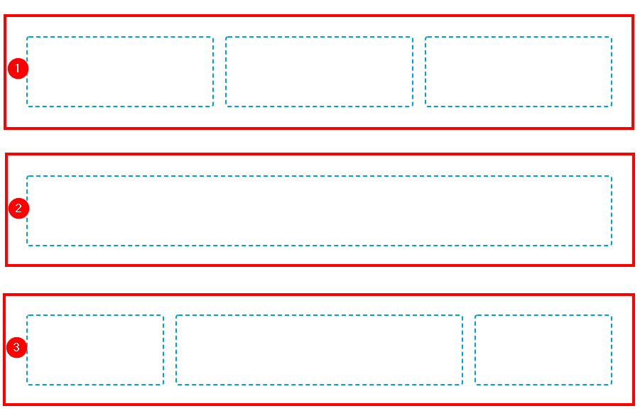
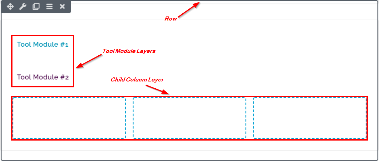
Columns are the content containers housed inside of rows, which allow you to build up your lesson content. Each row can contain several layers of columns and tool modules. Below is an example of a single row, containing a column that has three layered tool modules (in this case, the text editor tool):
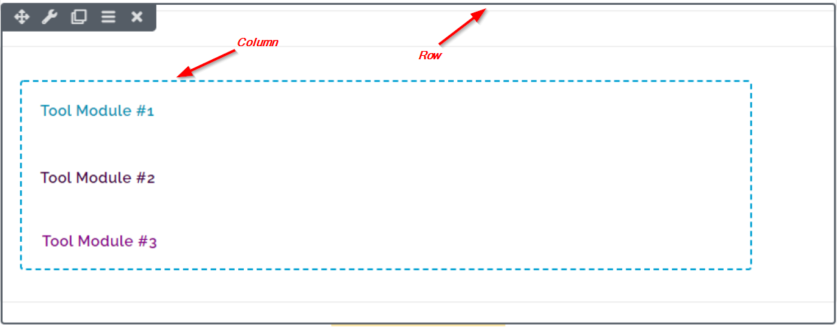
 You can create multiple layers in an individual column, but each layer can only contain a single tool module.
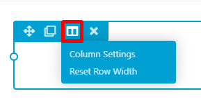
COLUMNS: SETTINGS
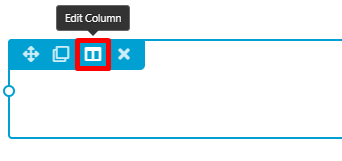
Column settings can be easily managed using the tool icons in the top left of each column:
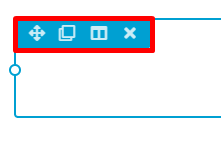
- Move your column
- Duplicate your column
- Access the column settings
- Delete your column
- Style
- Advanced
STYLE TAB
- Minimum Height: Adjust the height of your column.
- Text > Color: Select a text color for any text in your column.
- Text > Link Color: Select a link color for any links in your column.
- Text > Link Hover Color: Select a color for when hovering over any links.
- Text > Heading Color: Set a color for any headings in your column.
- Background > Type: Select the background type for your row. By default, this is set to None, but can be changed to Color, Gradient, or Photo.
- Border > Border: Select the color and width of the border, or adjust its radius and shadow.
ADVANCED TAB
When adding a row, the Advanced tab has the following options: Spacing, Visibility, Animation, HTML Elements, and Export/Import:
When uploading most assets, the Advanced tab will remain the same. To learn more about the advanced options, visit the Advanced Tab section.