Tutorials
- USER GUIDES & VIDEO TUTORIALS
- ALL VIDEO TUTORIALS
- OVERVIEW
- ASSETS
- CREATE COURSE
- Getting Started with Creating Courses
- Create Course - Course Settings
- Course Builder (TOC)
- Build Lessons
- Tool Settings
- Advanced Tab – An Overview
- Typography
- Borders
- Style and Spacing
- Colors
- Advanced Techniques
- Responsive Design
- Move or Resize Settings Panel
- Row Effects
- MANAGE COURSES
- MANAGE TEMPLATES
- MANAGE XAPI
- ADMIN
- ACCOUNT
Responsive Design
Table of Contents
RESPONSIVE DESIGN
RESPONSIVE BEHAVIOR
The Lesson Editor is fully web responsive without requiring additional coding, ensuring your content is responsive on any device size! C4EBridge accounts for responsiveness in large (i.e., desktop computer), medium (iPads or tablets), and small (iPhones or smartphones) devices.
RESPONSIVE SETTINGS
Your lesson layouts in C4EBridge are responsive with regard to the following factors and settings:
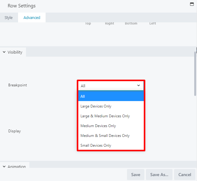
- Visibility: By default, modules are visible for all device sizes. You can customize visibility so that specific rows, columns, and tool modules can be hidden for certain device sizes.
- Spacing: By default, the system automatically resizes row/column/tool module padding and margins for smaller devices. You can customize to define padding and margins for specific device sizes or disable the automatic spacing feature.
- Stacking: This refers to how tool modules and columns are ordered at various display sizes. This can be controlled by defining custom column widths for specific device sizes.
- Breakpoints: This refers to the screen-width values (in pixels) for each device size, which can be adjusted if you want different behavior for different device sizes.
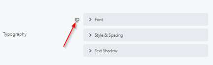
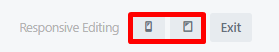
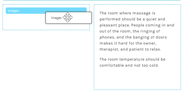
- Per-device settings: Some settings in rows, columns, or tool modules can be adjusted individually, as indicated by the responsive setting icon. For example, the Typography section of the settings panel typically allows for responsive editing, as indicated by the device icon to the left of the menu options:
RESPONSIVE EDITING MODE
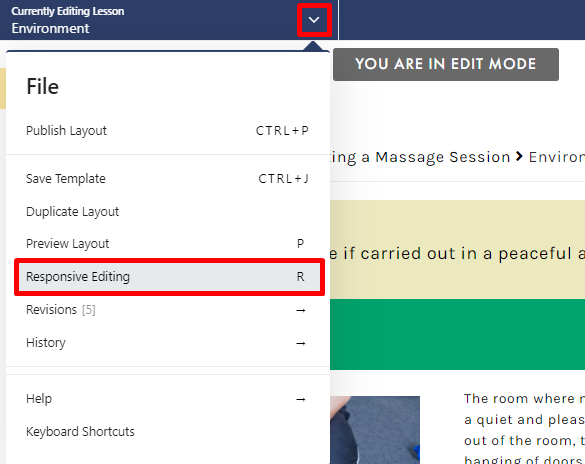
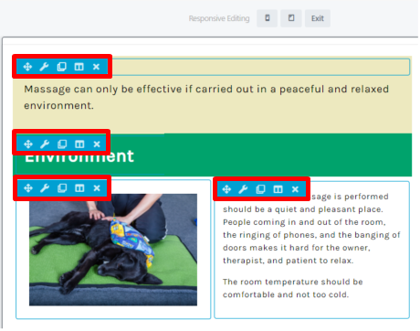
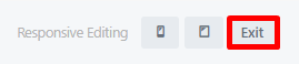
The RESPONSIVE EDITING option on the File menu of the Lesson Editor allows you to edit the appearance of your lesson page across different device sizes. Though the Lesson Editor is fully web responsive without requiring additional coding (ensuring your content is responsive on any device size), Responsive Editing is a helpful tool for those needing their pages to follow a specific format (allowing their containers to respond responsively).
To access this option, select RESPONSIVE EDITING from the File menu (or use the keyboard shortcut: R):
RESPONSIVE COLUMNS
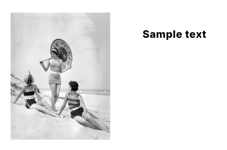
As you create your lesson layouts, it is important to consider how your columns will stack on your page across different device sizes. When creating your columns, we encourage you to preview your layout across large, medium, and small device sizes in order to fully anticipate how your content will appear to your users. With smaller screens, the columns and tool modules will stack left to right, and from top to bottom. Here is an example of two columns on a large device screen:

BREAKPOINTS
Breakpoints refer to the screen-width values (in pixels) for each device size, which can be adjusted if you want different behavior for different device sizes. To adjust the breakpoint for specific rows/columns/tool modules, simply access that item’s settings panel and locate the Visibility option on the Advanced tab: