Tutorials
- USER GUIDES & VIDEO TUTORIALS
- ALL VIDEO TUTORIALS
- OVERVIEW
- ASSETS
- CREATE COURSE
- Getting Started with Creating Courses
- Create Course - Course Settings
- Course Builder (TOC)
- Build Lessons
- Tool Settings
- Advanced Tab – An Overview
- Typography
- Borders
- Style and Spacing
- Colors
- Advanced Techniques
- Responsive Design
- Move or Resize Settings Panel
- Row Effects
- MANAGE COURSES
- MANAGE TEMPLATES
- MANAGE XAPI
- ADMIN
- ACCOUNT
Style and Spacing
STYLE AND SPACING
ALIGNMENT
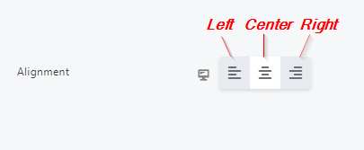
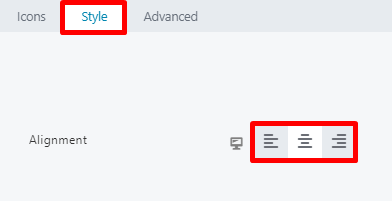


 The left, center, or right alignment options work as toggles, which can be turned on and off. If no option is selected, the default setting (such as one set by the theme) will dictate the alignment.
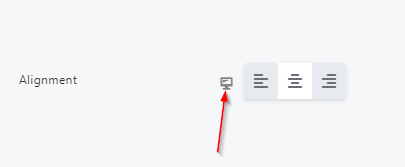
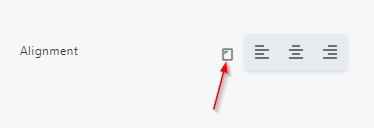
From the Alignment section for most lesson tools, the new alignment UI also features a responsive device icon, which helps you adjust alignment according to device size:
Simply click this icon to shift to a tablet/iPad screen size and add your alignment settings (the icon will change and you will see the Page Canvas resize to reflect a tablet screen):
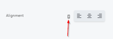
If no further changes are needed, click SAVE to save your changes or CANCEL to close without saving. Otherwise, you may proceed with any additional adjustments.
CSS, LENGTH, HEIGHT, SIZE UNIT
 To learn more about absolute and relative CSS units, including what each of the relative units is relative to, and which browsers support which units, visit the W3Schools website.
AVAILABLE UNITS IN LESSON EDITOR LAYOUTS
When editing your lessons in the Lesson Editor, the absolute px unit will always be available for every setting. As for relative settings, the units available depend on the specific setting and whether the applicable units have been enabled for that particular setting. For easy reference, the following table shows which CSS units are enabled for which settings: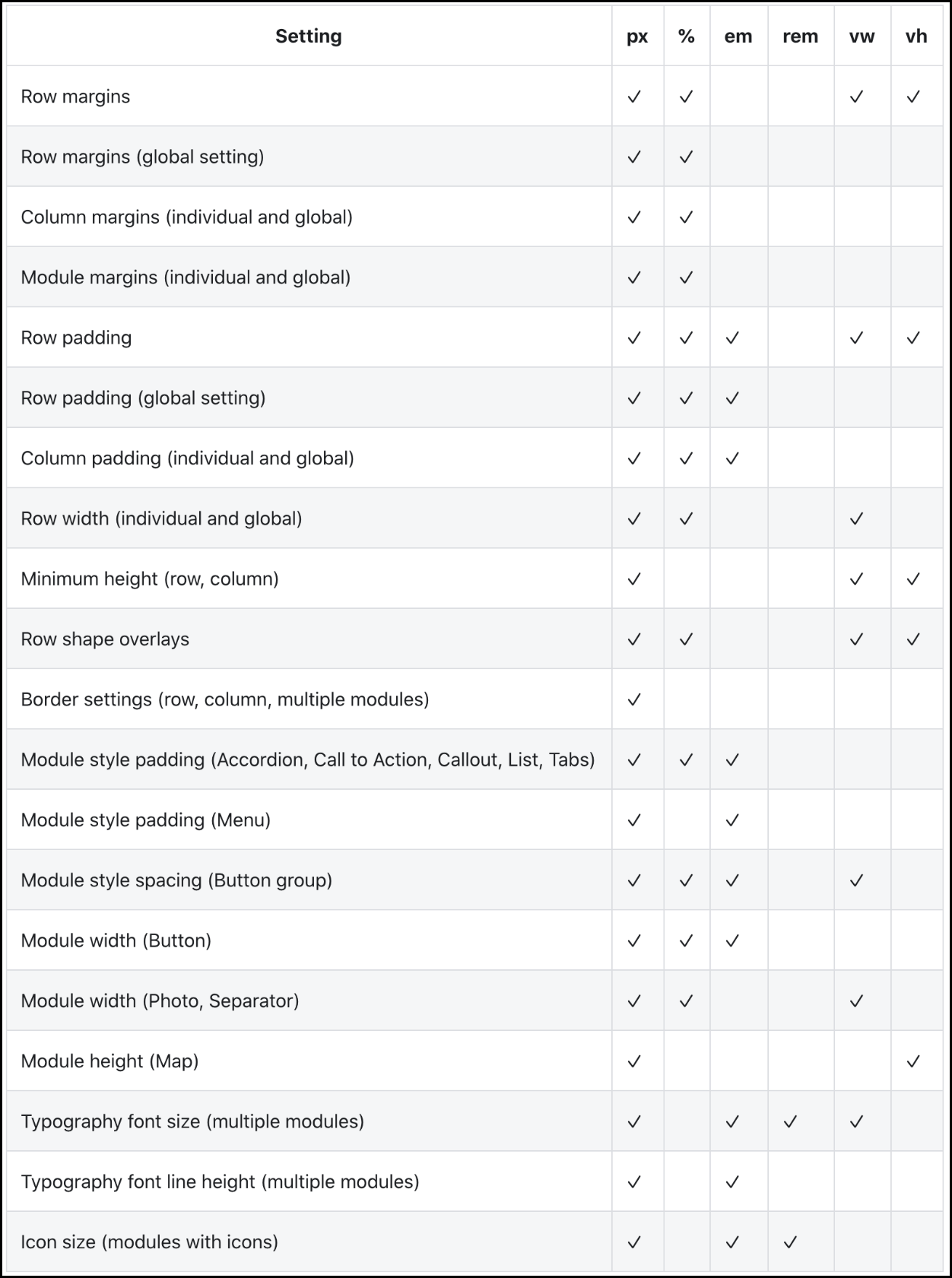
If a specific setting is not listed in this table, it is likely that the only available unit is px.
USING THE VW UNIT FOR FONT SIZE
When you set a font size using the vw unit in a tool’s Typography section, the actual font size in pixels is calculated using the CSS calc() function, with the following formula: calc( base-font-size + 1vw). If the global base font size is 16px, the calculation is: calc(16px + 1vw).
By using a base font size in this calculation, the font size scales more slowly as viewport width decreases, producing a better result for all device sizes.
WHEN TO USE ABSOLUTE OR RELATIVE UNITS
When deciding whether to use absolute or relative units, you must consider such factors as design, accessibility, and media queries. With so many things to consider, there is no simple answer to whether absolute or relative units should be used (and, if relative, which one).To guide you in making this decision, the following helpful resource is a great video tutorial for beginners: Typography units (em, rem, px, %) for beginners – Webflow CSS tutorial (video).
Most browser versions supported by C4EBridge support all the CSS units available for layouts. However, if you are planning for your website to be used in a restricted browser situation, check the Browser Support table at the W3Schools site for compatibility.