Tutorials
- USER GUIDES & VIDEO TUTORIALS
- ALL VIDEO TUTORIALS
- OVERVIEW
- ASSETS
- CREATE COURSE
- Getting Started with Creating Courses
- Create Course - Course Settings
- Course Builder (TOC)
- Build Lessons
- Lesson Settings
- Lesson Page Navigation
- Lesson Editor Overview
- Lesson Editor - File Options
- Add Content - Tools: Assets
- Add Content- Tools: Page Elements
- Add Content - Page Templates
- Add Content - Layout Templates
- Save As a Row, Column, Tool As a Template
- Tool Settings
- Row Effects
- MANAGE COURSES
- MANAGE TEMPLATES
- MANAGE XAPI
- ADMIN
- ACCOUNT
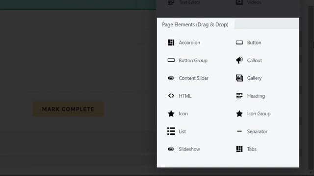
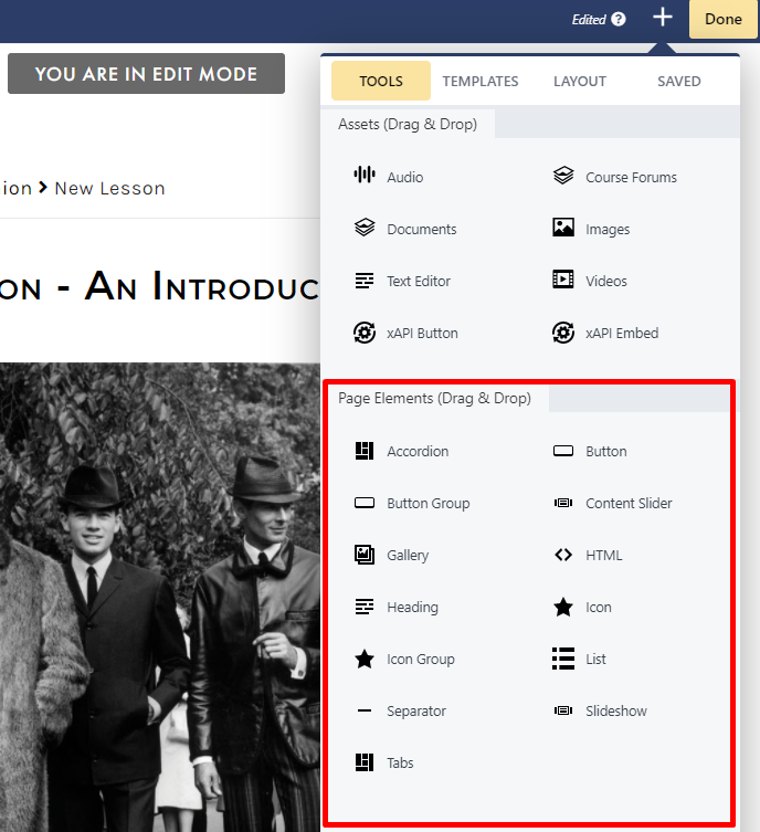
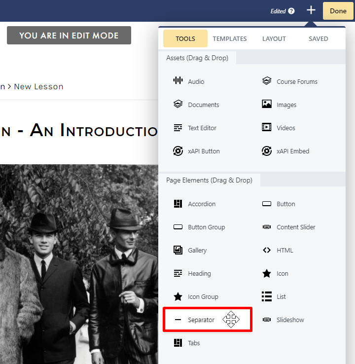
Add Content- Tools: Page Elements
QUICK START VIDEO TUTORIAL – ADD PAGE ELEMENTS
2.27
ADD CONTENT: TOOLS PAGE ELEMENTS
PAGE ELEMENTS OVERVIEW
 To review how to access the Lesson Editor, visit the Introduction to the Lesson Editor section.
ACCORDIONS VS TABS
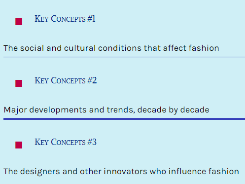
ACCORDIONS
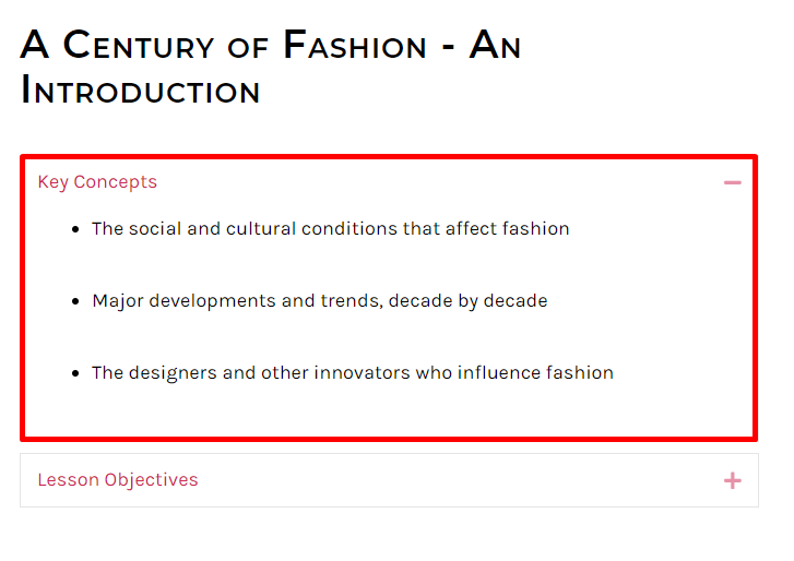
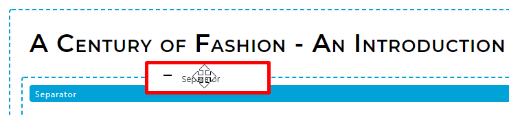
An accordion displays a list of items as title-content pairs, and is a useful tool for progressive disclosure — highlighting important details of a section and revealing additional details as wanted with just a tap or click. When the accordion is collapsed, only the item titles are displayed: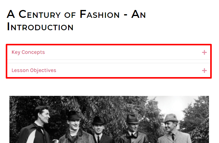
WHEN TO USE ACCORDIONS
- When responsive design is needed. Accordions are ideal for responsive design as they must fit in one screen, unlike tabs, which may require a horizontal scroll.
- When offering users more experiential learning. Accordions allow you to easily animate the transition between the slides, offering lots of room to experiment with mouseover, expansion, collapse and more. This provides learners with a fun and interactive approach to learning.
TABS
Similar to accordions, tabs are another useful way to add content to your lessons. Using tabs is a helpful way to present your readers easy-to-digest chunks of information. A metaphor is folders kept in a drawer, the tabs tool lets you group together a number of folders, each featuring specific content: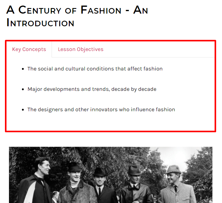
WHEN TO USE TABS
- When information can be divided into chunks and does not need to be compared or accessed simultaneously. Tabs organize content into categories to help users easily find different types of information.
- When avoiding very long page- scrolling. Tabs optimize page real estate by showing different information within the same space, and inserting large amounts of text into a small space. Conversely, accordions take more space than tabs to show the same information.
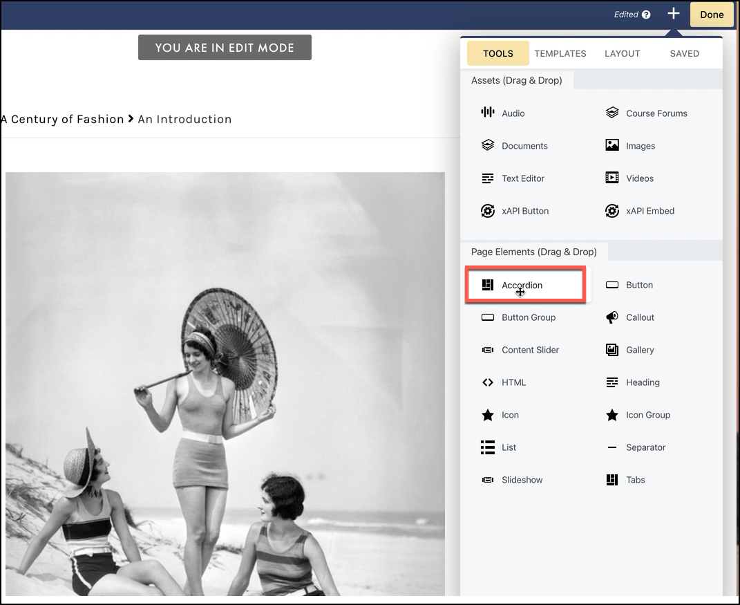
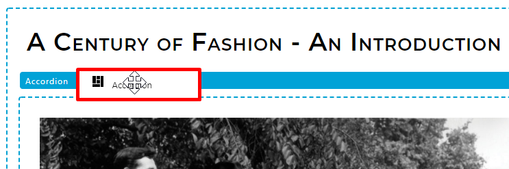
TO ADD AN ACCORDION TO YOUR LESSON
- Items
- Style
- Advanced
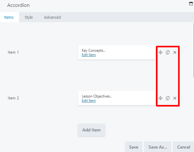
ITEMS TAB
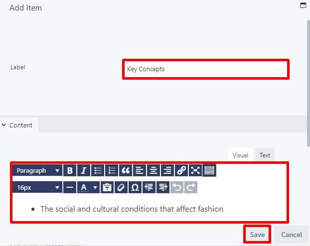
From the Items tab, you can define the items you wish to include in your accordion. Select EDIT ITEM to add your first item: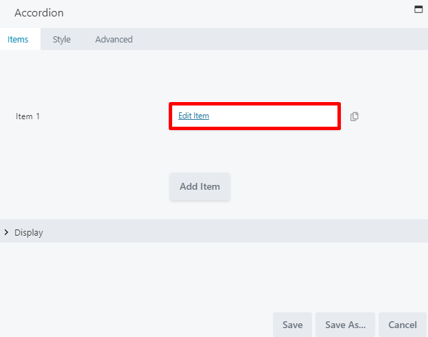
- A label field, to add the item title.
- A content pane, which provides a text editor box to add your item content.
If you do not see the second line of text options, select the toggle icon in the top right of the paragraph line.
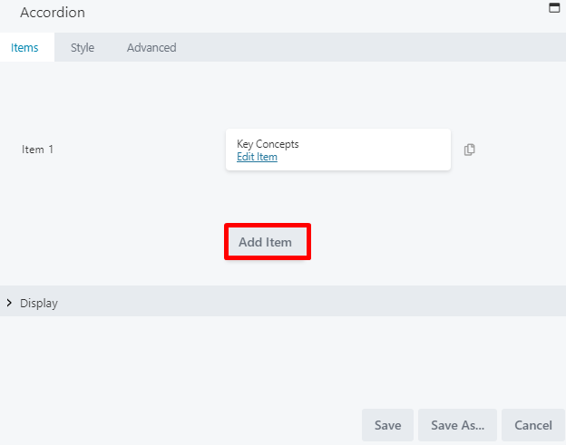
- Move items up or down in the list
- Duplicate an item
- Delete an item
DISPLAY SECTION
When adding items to your accordion, you may use the Display section to set your Display settings: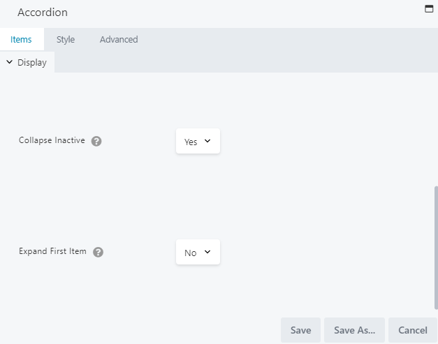
- Collapse Inactive: This setting controls whether more than one item can be expanded at one time. By default, this is set to YES, which allows only one item to be expanded at a time. To allow more than one item to be expanded at a same time, change this setting to NO.
- Expand First Item: This setting controls whether the first item should be expanded on first view (before users click to expand anything). By default, this is set to NO, which keeps all items collapsed until the user expands them.
Once you have saved your first item in the accordion, it will remain expanded in the Page Canvas even if the Expand First Item setting is set to No. This allows you to preview your style settings while editing from the Page Canvas. Once your lesson page has been published, it will correctly follow the Expand First Item setting.
STYLE TAB
When adding items to your accordion, you may use the Style tab to adjust the style settings. The Style tab is divided into four sections: the top section, the Label, Icon, and Content sections.Top Section
The top section allows you to choose the item size, item spacing, and item border: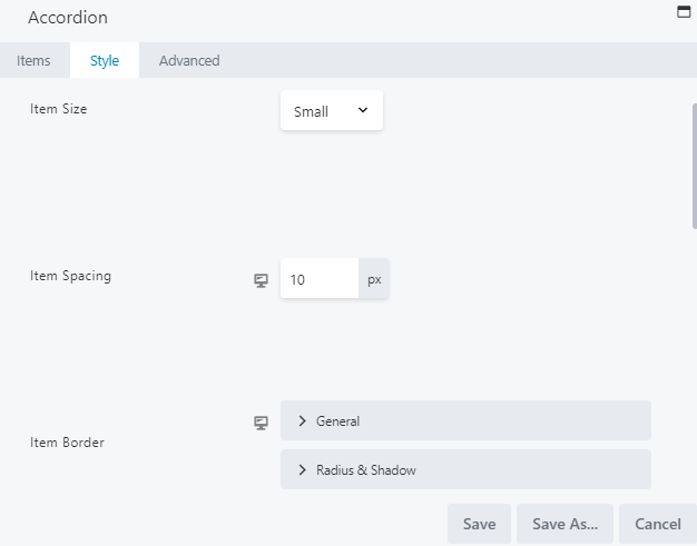
- Item Size: Choose to make your item Small, Medium, or Large. This setting functions like a preset and controls item padding and, in some cases, font size. When the font size used is the default size (as set by the theme), then font size is controlled by this preset. If you set a specific font size for the label or content in the Typography section on this tab, then that custom size will overrule this preset.
- Item Spacing: Adjust the vertical space between items.
- Item Border: Select the color and width of the border, or adjust its radius and shadow.
Label Section
The Label section controls the styling of item labels, which appear when items are collapsed. From this section, you can adjust the text color, background color, padding, and typography: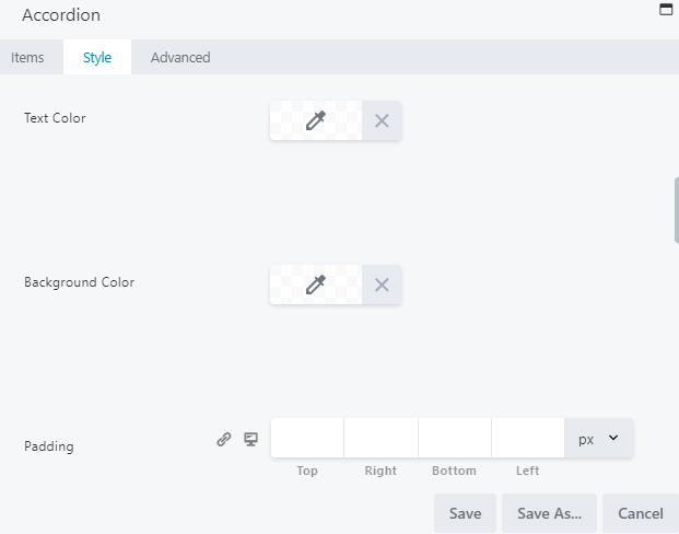
- Text Color: Select a text color for labels on inactive tabs (or tabs not yet clicked).
- Background Color: Select a background color for the label on the active tab (or the tab that has been selected and is actively displaying content).
- Padding: Set a specific padding value for your labels in pixels.
- Typography: Select the font family, weight, size, and alignment.
 Accordion labels are not marked as headings in the rendered output and use the default text font and size, unless any custom settings have been defined in the Text > Text Typography section.
Icon Section
The Icon section modifies the icon to the right of each item, which lets users expand and collapse the accordion items. You can change the icon position from left to right and select new icons for expanding (by default, + sign) and collapsing (by default, – sign):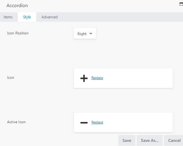
- Icon Position: Change the position of your icon. By default, the icon is set to the right.
- Icon: Replace the default icon for when expanding your accordion.
- Active Icon: Replace the default icon for when collapsing your accordion.
Content Section
The Content section controls how text appears when an item is expanded. From this section, you can adjust the content text color, background color, padding, and typography: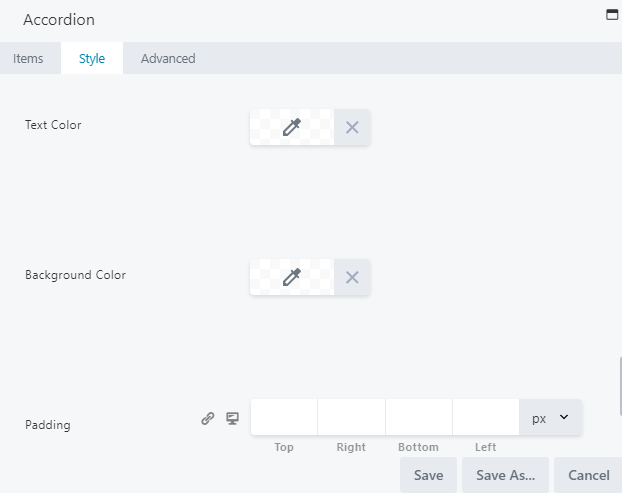
- Text Color: Select a text color for your content.
- Background Color: Select a background color for your content.
- Padding: Set a specific padding value for your labels in pixels.
- Typography: Select the font family, weight, size, and alignment.
ADVANCED TAB
When adding a page element, the Advanced tab has the following options: Spacing, Visibility, Animation, HTML Elements, and Export/Import: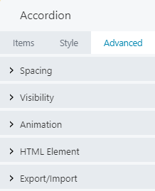
These options give you greater flexibility in customizing your page element container. When uploading most assets, the Advanced tab will remain the same. To learn more about the advanced options, visit the Advanced Tab section.
SAVE OR SAVE AS
Once your changes are complete, click SAVE to save your changes and add the accordion to your lesson page or CANCEL to close without saving. You may also use the SAVE AS button to save the accordion as a template (either global or not), to be reused in another lesson or course.See the Save As a Row, Column, or Tool for Reuse section for more information.
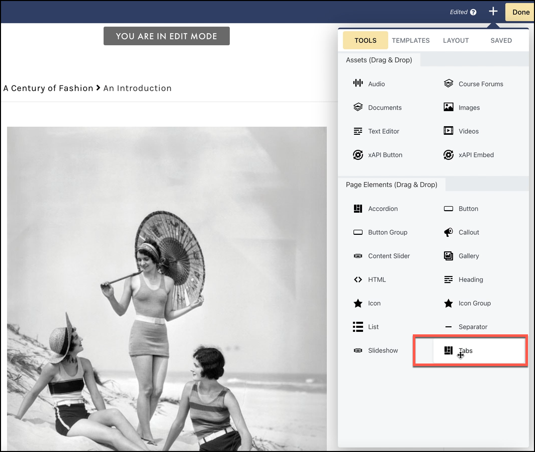
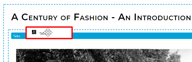
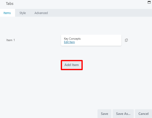
TO ADD TABS TO YOUR LESSON
- Items
- Style
- Advanced
ITEMS TAB
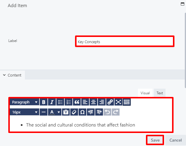
From the Items tab, you can define the items you wish to include in your accordion. Select EDIT ITEM to add your first item: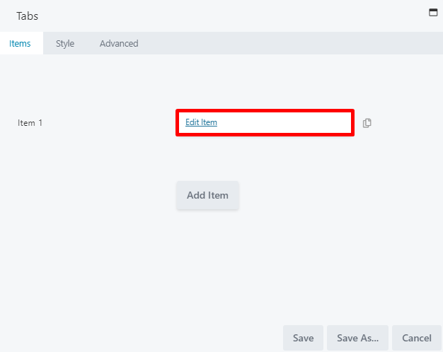
- A label field, to add the item title.
- A content pane, which provides a text editor box to add your item content.
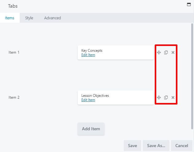
- Move items up or down in the list
- Duplicate an item
- Delete an item
STYLE TAB
When adding items to your tabs, you may use the style tab to adjust the style settings. This tab allows you to completely customize your page asset. The Style tab is divided into four sections: the top section, and the Label, Icon, and Content sectionsTop Section
The top section allows you to choose the item layout, background color, border color and border width: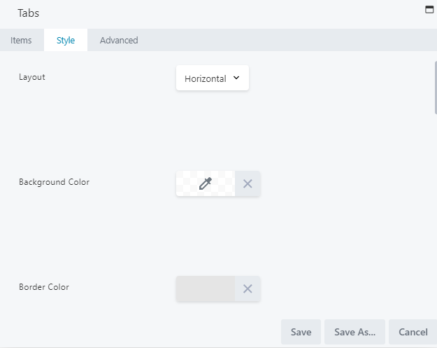
- Layout: Choose to make the layout for your tabs vertical if desired (by default, this is set to horizontal). This adjusts whether your tabs are structured horizontally or vertically.
- Background Color: Select a color for your tabs background.
- Border Color: Choose a color for your border.
- Border Width: Set a border width.
Label Section
The Label section controls the styling of item labels that appear on your tabs. From this section, you can adjust the text color, active color, padding, and typography: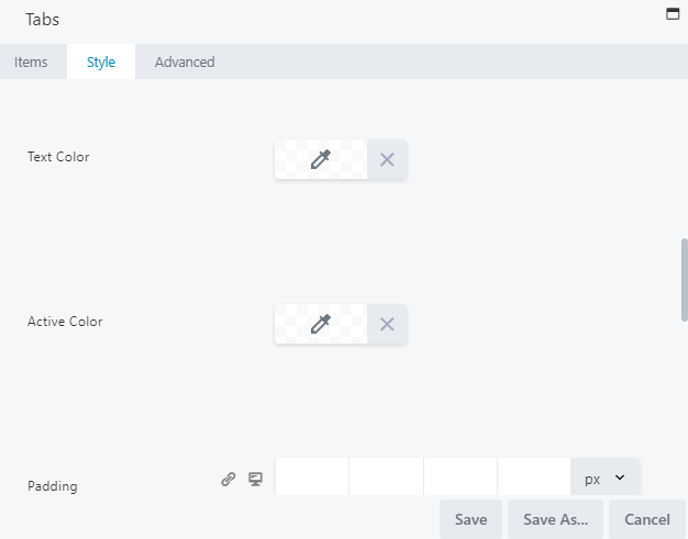
- Text Color: Select a text color for your labels.
- Active Color: Select a color for your labels.
- Padding: Set a specific padding value for your labels in pixels.
- Typography: Select the font family, weight, size, and alignment.
Content Section
The Content section controls how text appears when an item is displayed on a tab. From this section, you can adjust the content text color, padding, and typography: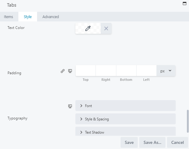
- Text Color: Select a text color for your content.
- Padding: Set a specific padding value for your content in pixels.
- Typography: Select the font family, weight, size, and alignment.
ADVANCED TAB
When adding a page element, the Advanced tab has the following options: Spacing, Visibility, Animation, HTML Elements, and Export/Import: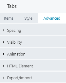
When uploading most assets, the Advanced tab will remain the same. To learn more about the advanced options, visit the Advanced Tab section.
SAVE OR SAVE AS
Once your changes are complete, click SAVE to save your changes and add the tabs to your lesson page or CANCEL to close without saving. You may also use the SAVE AS button to save these tabs as a template (either global or not), to be reused in another lesson or course.See the Save As a Row, Column, or Tool for Reuse section for more information.
SEPARATOR
- General
- Advanced
GENERAL TAB
From the General tab, you can adjust the separator color, height, width, alignment, and style: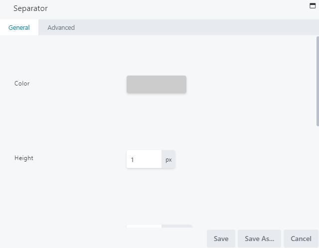
- Color: Select the desired color for your separator.
- Height: Adjust the thickness of your separator height.
- Width: Modify this item’s width to adjust how far the separator spans across the lesson page. By default, the width is measured in %, but you may also choose a px, or vw unit of measurement.
- Align: Set your preferred alignment for the separator. You may select from the standard left, center, or right align.
- Style: By default, the style is set to solid, but can be adjusted to dashed, dotted, or double.
ADVANCED TAB
When adding a page element, the Advanced tab has the following options: Spacing, Visibility, Animation, HTML Elements, and Export/Import: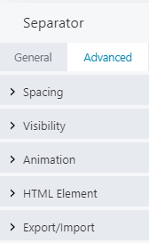
When uploading most assets, the Advanced tab will remain the same. To learn more about the advanced options, visit the Advanced Tab section.
SAVE OR SAVE AS
Once your changes are complete, click SAVE to save your changes and add the separator to your lesson page or CANCEL to close without saving. You may also use the SAVE AS button to save the separator as a template (either global or not), to be reused in another lesson or course.See the Save As a Row, Column, or Tool for Reuse section for more information.
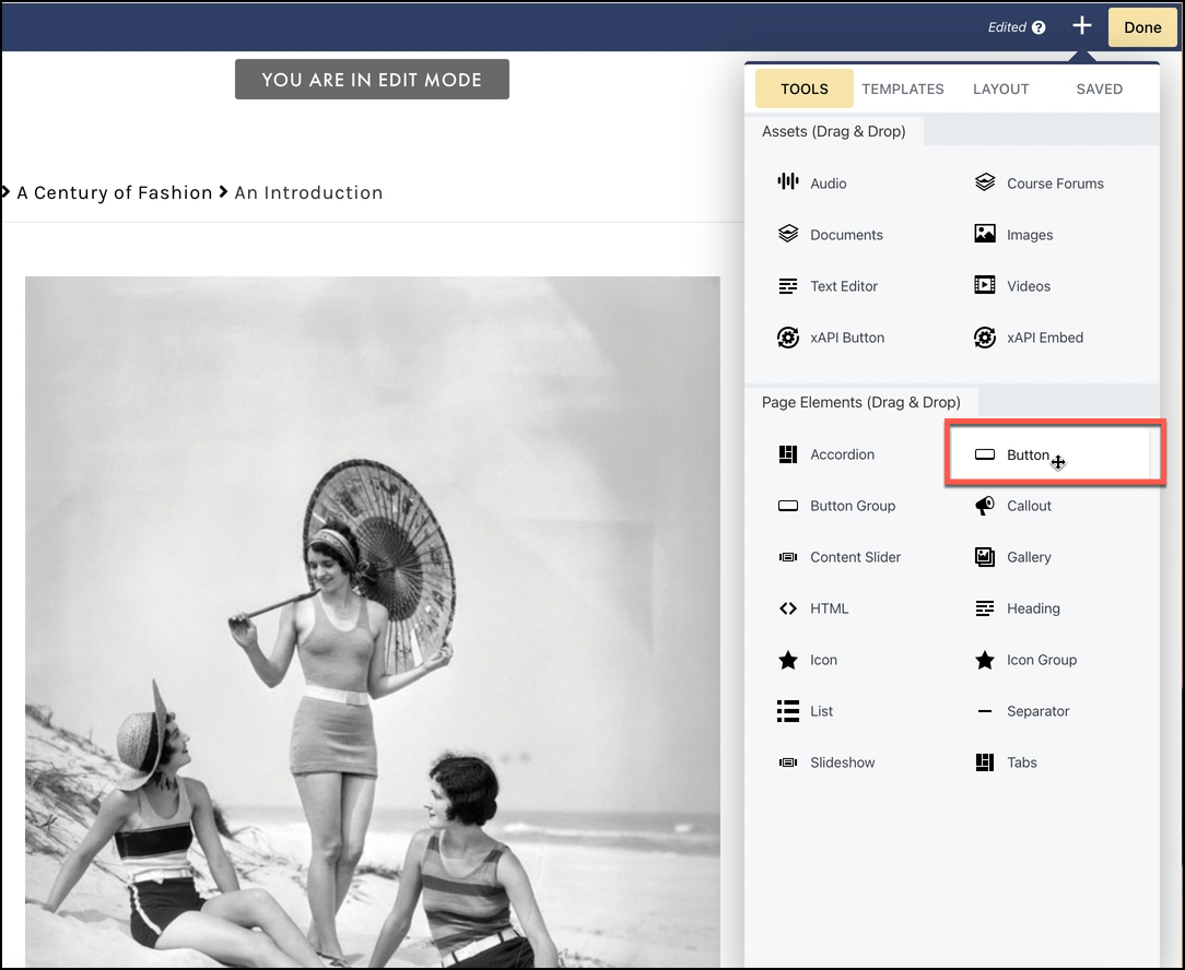
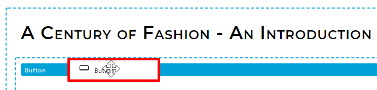
BUTTON
- General
- Style
- Advanced
GENERAL TAB
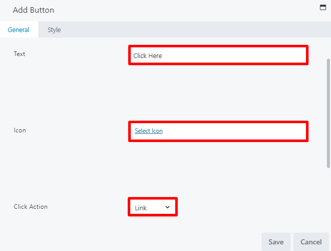
From the General tab, you can adjust the button text, icon, and click action: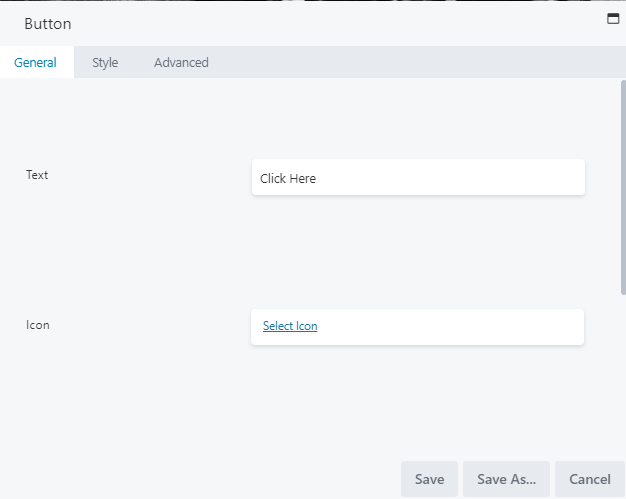
- Text: Modify the text you wish to appear on the button.
- Icon: Add an icon to appear on the button (this is optional). If you select an icon, two additional fields appear:
- Icon position: Select from BEFORE TEXT or AFTER TEXT.
- Icon Visibility: Select from ALWAYS VISIBLE or FADE IN ON HOVER.
- Click action: Select whether the button action should open a link in a new window or open a lightbox with additional information. Click action is discussed further in the sections below.
Set the click action to a link
When setting the click action to a link, you may enter your URL in the LINK field or click SELECT to choose a page or post from your course: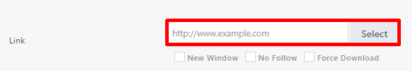
Set the click action to a lightbox
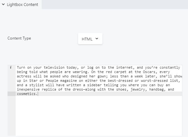
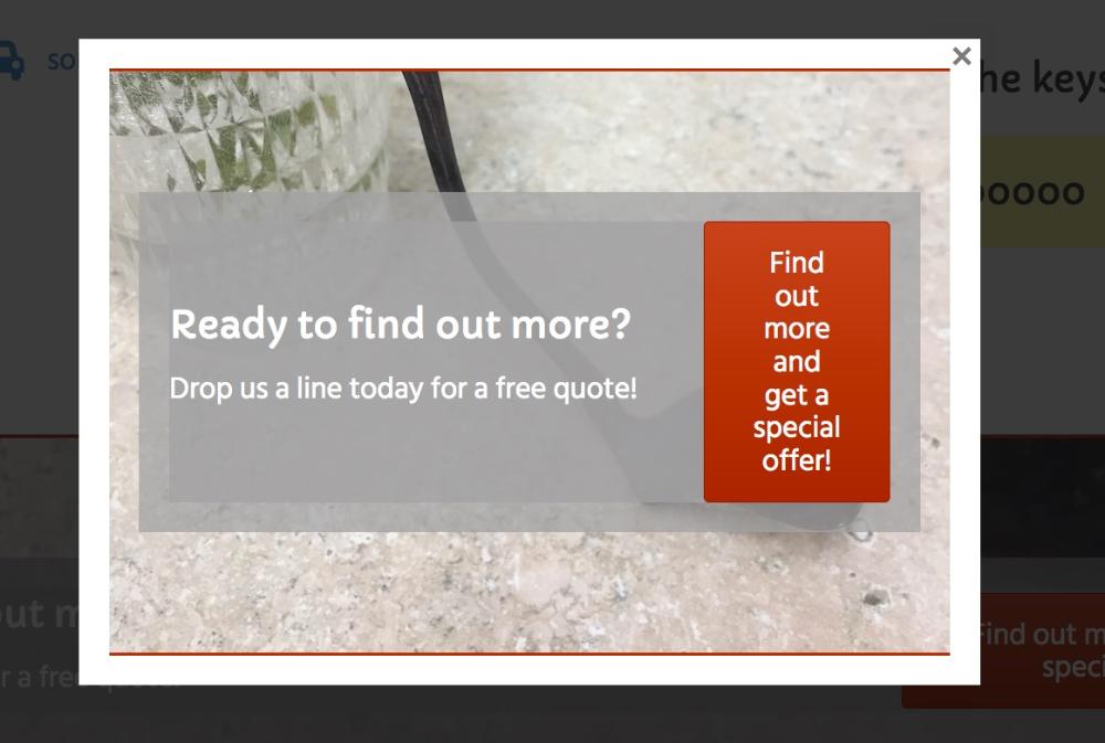
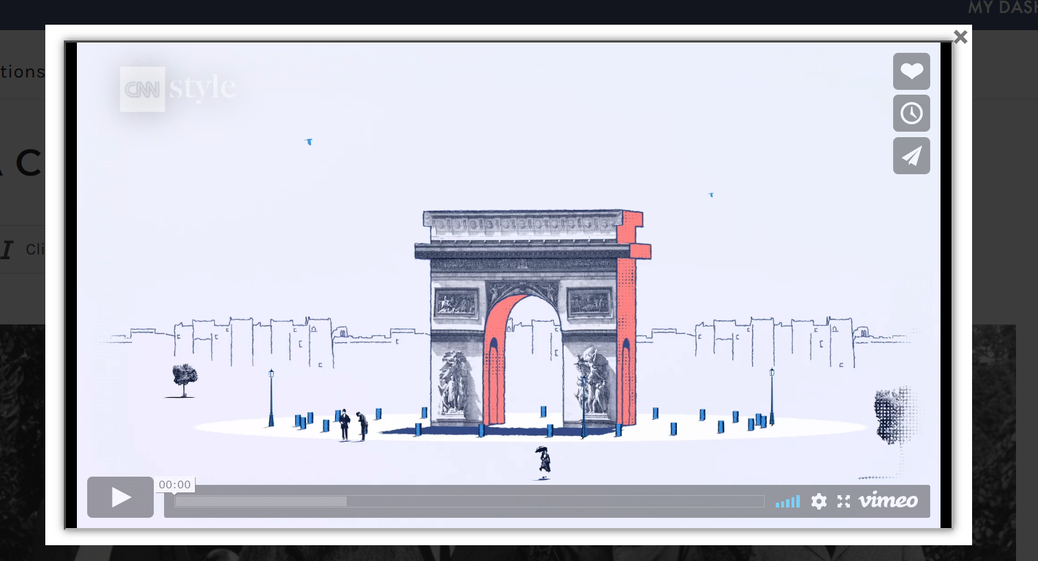
When setting the click action to a lightbox, you may choose whether the lightbox will display custom HTML content or play a YouTube or Vimeo URL: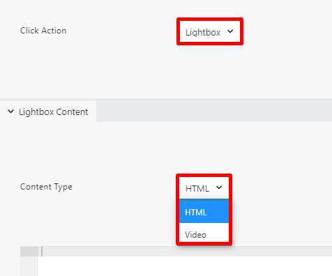

STYLE TAB
When adding a button to your lesson page, you may use the Style tab to adjust the style settings. This tab allows you to completely customize your page asset. The Style tab is divided into four sections: the top section, and the Text, Background, and Border sections: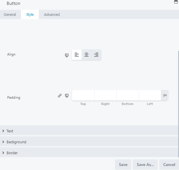
Top Section
The top section allows you to choose the button width, alignment, and padding: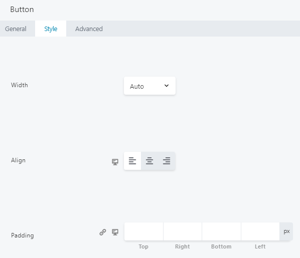
- Width: Set to auto width, by default. Adjust to full width to have the button span the lesson page, or select a custom width in px, vw, or %.
- Align (Responsive): Set your preferred alignment for the button. You may select from the standard left, center, or right align.
- Padding (Responsive): Set a specific padding value for your button in pixels. Click the link icon to automatically set all four padding values identically.
For responsive settings, click the computer icon to toggle the setting for desktop, tablet, and mobile displays.
Text Section
The Text section lets you select your button text settings: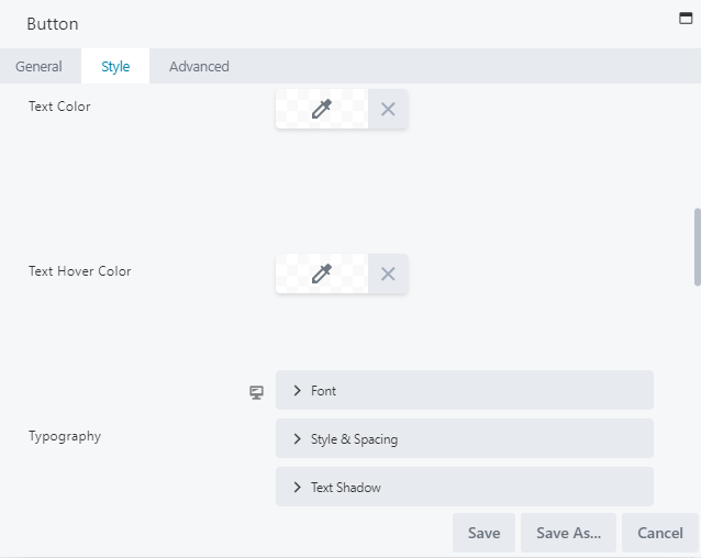
- Text Color: Choose the text color for when the button is in resting state.
- Text Hover Color: Choose the text color for when hovering over the button. If this setting is left blank, the system will use whichever color is set for the Text Color field.
- Typography: Select the font family, weight, size, and alignment.
For more information on Typography, visit the Typography section.
Background Section
The Background section lets you adjust the button background color, style, and animation: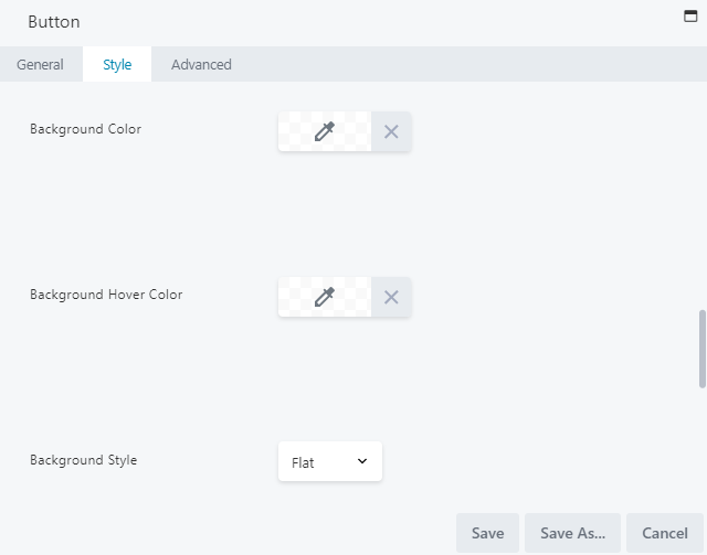
- Background Color: Select a fill color for when the button is in resting state.
- Background Hover Color: Choose the fill color for when hovering over the button. If this setting is left blank, the system will use whichever color is set for the Background Color field.
- Background Style: Select from flat, which is a solid fill color, or gradient, which is lighter on top and darker on the bottom.
- Background Animation: Select ENABLED to display a 0.2-second linear transition from resting state to hover state. This is disabled by default.
Border section
The Border section lets you set a border, adjust its radius and shadow, and choose its color: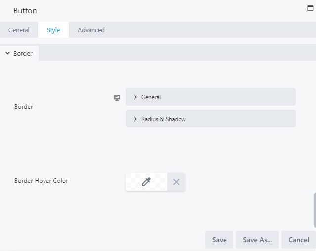
- Border: Select your general border settings (style, color and width), as well as its radius and shadow.
- Border Hover Color: Select the color for when hovering over your border.
For more information on borders, visit the Border section.
ADVANCED TAB
When adding a page element, the Advanced tab has the following options: Spacing, Visibility, Animation, HTML Elements, and Export/Import: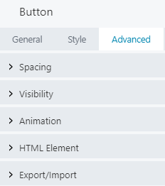
When uploading most assets, the Advanced tab will remain the same. To learn more about the advanced options, visit the Advanced Tab section.
SAVE OR SAVE AS
Once your changes are complete, click SAVE to save your changes and add the button to your lesson page or CANCEL to close without saving. You may also use the SAVE AS button to save the button as a template (either global or not), to be reused in another lesson or course.See the Save As a Row, Column, or Tool for Reuse section for more information.
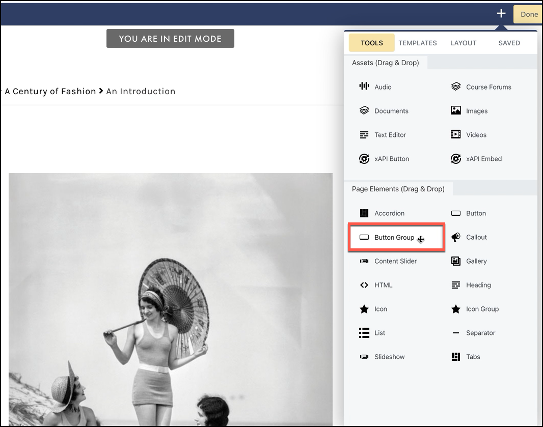
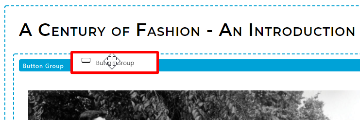
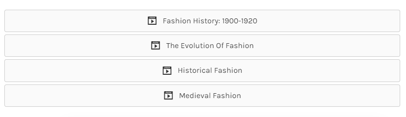
BUTTON GROUP
- Buttons
- Style
- Advanced
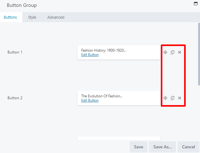
BUTTONS TAB
From the Buttons tab, you can define each button in your button group. Select EDIT BUTTON to the right of Button 1 to configure your first button: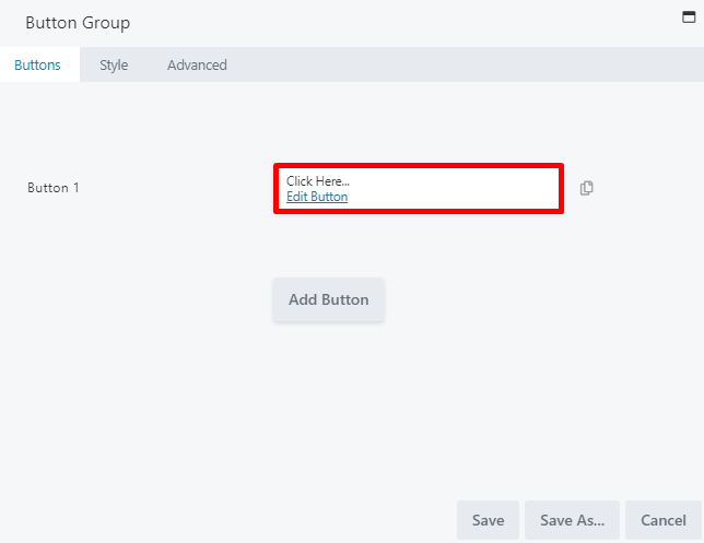
Style settings can be globally adjusted in the general Style tab on the Button Group window, which will apply to ALL buttons in the group. However, you may make changes in an individual button’s Style tab to override any globally set settings.

- Move buttons up or down in the list
- Duplicate a button
- Delete a button
STYLE TAB (GLOBAL)
The global Style tab on the Button Group window controls the style settings for ALL buttons in the group (unless style settings were adjusted for any individual buttons from the Add Button window, which would override global settings). The global Style tab for the button group is divided into four sections: the top section, and the Text, Background, and Border sections.Top Section (Global)
The top section allows you to select your button group layout, alignment, space between buttons, and padding: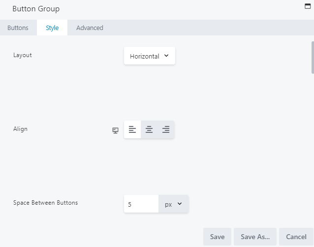
- Layout: By default, your button group layout is set to display your buttons horizontally. Select a vertical layout to stack your buttons vertically::
TIP: As screen size decreases, a horizontal layout will shift to stack buttons vertically. To compare layouts at different screen sizes, select R on your keyboard to enter Responsive mode.
- Align (Responsive): Set your preferred alignment for the button group. You may select from the standard left, center, or right align.
- Space Between Buttons (Responsive): Increase or decrease the amount of horizontal or vertical space around the outside of each button. You can set the spacing as px, em, %, or vw.
- Width: Select CUSTOM to adjust the width of your buttons. By default, this is set to FULL WIDTH, which spans the lesson page.
- Padding (Responsive): Adjusts the padding between the edge of the item container and the group of buttons.
For responsive settings, click the computer icon to toggle the setting for desktop, tablet, and mobile displays.
Text Section (Global)
Use the Text section to globally adjust the text for all buttons in your group (unless style settings were adjusted for any individual buttons from the Add Button window, which would override global settings):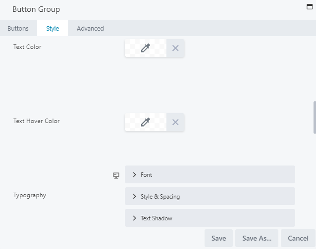
- Text Color: Choose the text color for when your buttons are in resting state.
- Text Hover Color: Choose the text color for when hovering over your buttons. If this setting is left blank, the system will use whichever color is set for the Text color setting.
- Typography (Responsive): Select the font family, weight, size and alignment.
For more information on Typography, visit the Typography section.
For responsive settings, click the computer icon to toggle the setting for desktop, tablet, and mobile displays.
Background Section (Global)
The Background section lets you adjust the button background color, style, and animation: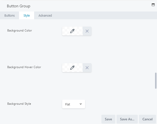
- Background Color: Select a fill color for when your buttons are in resting state.
- Background Hover Color: Choose the fill color when hovering over your buttons. If this setting is left blank, the system will use whichever color is set for the Background Color field.
- Background Style: Select from flat, which is a solid fill color, or gradient, which is lighter on top and darker on the bottom.
- Background Animation: This is disabled by default. Select ENABLED to display a 0.2-second linear transition from resting state to hover state.
Border Section (Global)
The global Border section lets you set a border for ALL of your buttons, as well as adjust its radius and shadow, and choose its color (unless style settings were adjusted for any individual buttons from the Add Button window, which would override global settings):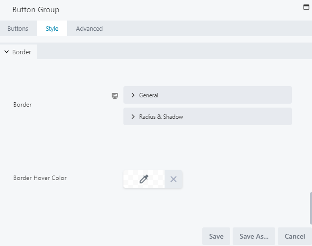
- Border: Select your general border settings (style, color and width), as well as its radius and shadow.
- Border Hover Color: Select the color for when hovering over your border.
For more information on borders, visit the Border section.
ADVANCED TAB
When adding a page element, the Advanced tab has the following options: Spacing, Visibility, Animation, HTML Elements, and Export/Import: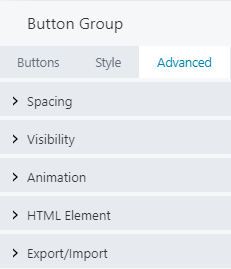
When uploading most assets, the Advanced tab will remain the same. To learn more about the advanced options, visit the Advanced Tab section.
SAVE OR SAVE AS
Once your changes are complete, click SAVE to save your changes and add the button group to your lesson page or CANCEL to close without saving. You may also use the SAVE AS button to save the button group as a template (either global or not), to be reused in another lesson or course.See the Save As a Row, Column, or Tool for Reuse section for more information.
CONTENT SLIDER
- A background (color, photo, video, or none)
- An overlay (text, text + photo, text + video, or none)
- A text or button link
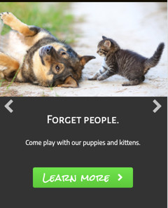
- A slide with a photo background and an overlay with text and a button:
The text overlay can have its own background color or no color. On smaller devices, the navigation and overlay appear below the background photo: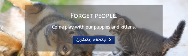
- A slide with a photo background and an overlay with text and a photo:
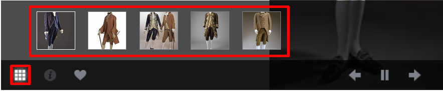
Depending on settings and screen width, the text can appear to the left or right of the photo or vertically aligned. At small screen widths, the overlay photo appears above the content and the background image is hidden, as shown in the following screenshot: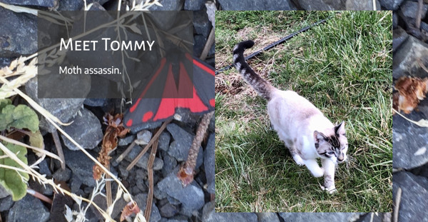
As in the above image, you can have arrows, dots, or both (or none) for navigation. Notice the arrows (overlaid on the background image) and dots (below the content) in this image.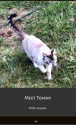
USES OF THE CONTENT SLIDER
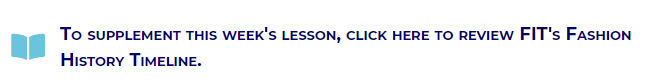
The Content Slider tool is optimal for when you want to construct a relatively small set of slides with overlaid content by hand. This tool is helpful if you have more than one call to action that you want to display in a series, or if you want to display a series of related information (i.e., a visual timeline of fashion in the early Twentieth Century). One thing to consider when utilizing the Content Slider tool is that the main image is in the background, which subjects it to the same consideration as using background images in rows and columns, which is that the image can get cropped. With this in mind, the main image may not appear as intended on certain device sizes. As the content slider settings don’t allow background image positioning or different images for smaller devices, you will need to be sure to check each slide carefully and adjust your images in an image editor.TO ADD A CONTENT SLIDER TO YOUR LESSON
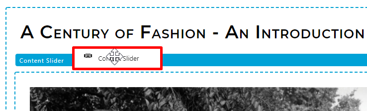
To add a content slider to your lesson page, you may drag the CONTENT SLIDER option and drop it to the desired location on your lesson page: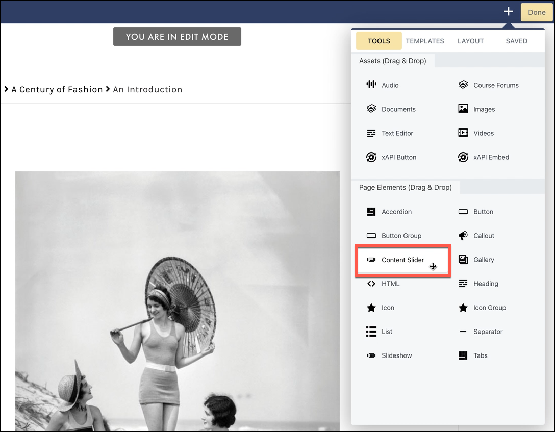
- Slides
- Slider
- Style
- Advanced
SLIDES
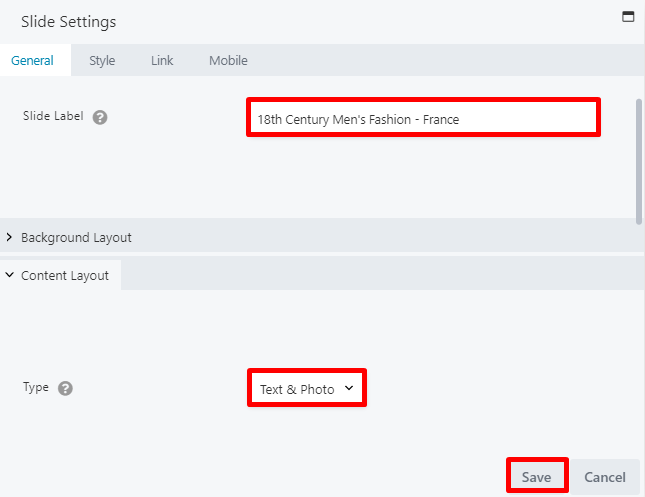
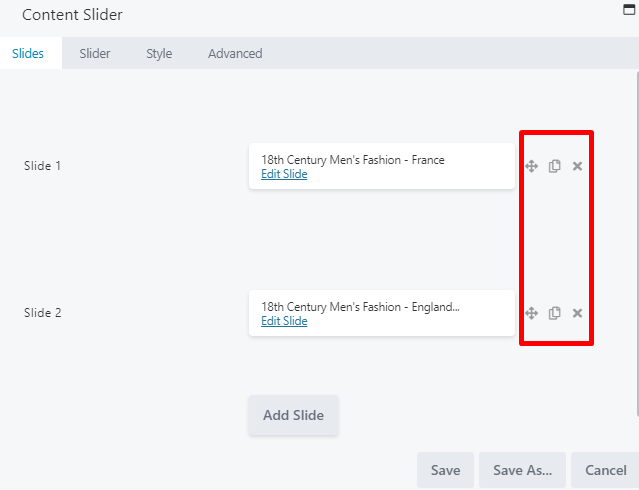
The Slides tab lets you define each slide of your content slider, giving you great flexibility in how you want to present your content. In each slide, you can choose a photo, video, or color background and add a heading, text, and a button to be displayed over the photo/video/color background or side by side with the photo or video. Select EDIT SLIDE to add your first slide:
- A slide label field, to add the slide title.
- A background layout, from which you can select a photo, video, color, or no background.
- A content layout, if you wish to add content over or in addition to the background layout. You can select from text, text & photo, text & video, or none.

- Move slides up or down in the list
- Duplicate a slide
- Delete a slide
SLIDER
When adding items to your content slider, you may use the Slider tab to automate and adjust playback, or add navigation buttons so users can cycle through the slides themselves: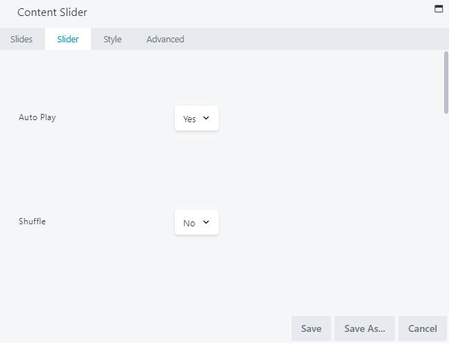
- Auto Play: To disable auto play, select No.
- Shuffle: To shuffle your slides, select YES.
- Pause on Hover: If you don’t want your content slider paused when users hover over it, select No..
- Loop: If you don’t want your content slider to automatically loop between slides, select No..
- Delay: Set the speed you wish to delay between slides. This should be greater than the transition speed.
- Transition: To feature a fade transition between slides, select FADE.
- Transition Speed: Set the speed you wish to transition (fade or slide) between slides. This should be slower than the delay speed.
- Show Play/Pause: Select YES to show Play/Pause controls, so that users may navigate through the content slider themselves.
- Show Arrows: Select YES to show arrow controls, so that users may navigate through the content slider themselves.
- Show Dots: Select YES to show navigation dots, so that users may navigate through the content slider themselves.
Setting the Transition Speed for a shorter time than the Delay ensures your images display properly and are not skipped because they haven’t finished transitioning before the next slide is displayed.
STYLE TAB
When adding slides to your content slider, you may use the Style tab to set a height and weight for your content, and style the arrow color, background color, and shape (if you have enabled navigation arrows):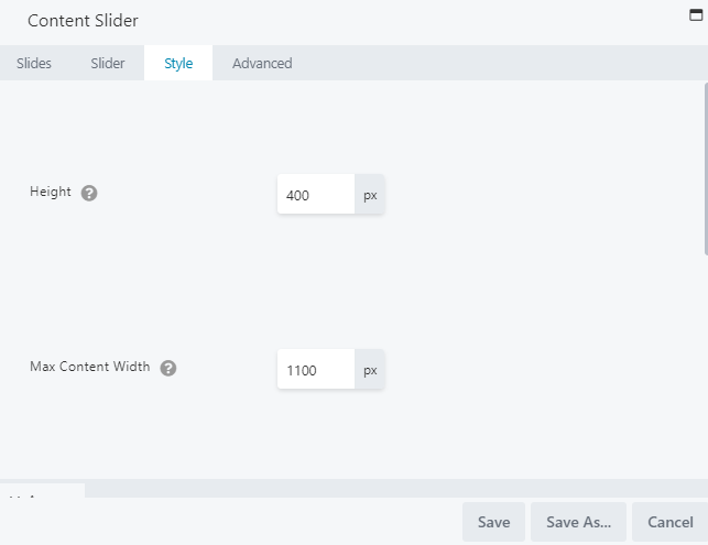
- Height: Set a height for your content slider.
- Max Content Width: Set a width for your content slider.
- Arrows > Arrows Background Color: Set a background color for your navigation arrows.
- Arrows > Arrows Background Style: Select your background style for your arrows.
- Arrows > Arrows Color: Select a color for your arrows.
ADVANCED TAB
When adding a page element, the Advanced tab has the following options: Spacing, Visibility, Animation, HTML Elements, and Export/Import: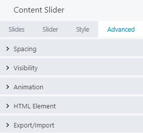
When uploading most assets, the Advanced tab will remain the same. To learn more about the advanced options, visit the Advanced Tab section.
SAVE OR SAVE AS
Once your changes are complete, click SAVE to save your changes and add the content slider to your lesson page or CANCEL to close without saving. You may also use the SAVE AS button to save the content slider as a template (either global or not), to be reused in another lesson or course.See the Save As a Row, Column, or Tool for Reuse section for more information.
GALLERY
USES OF THE GALLERY TOOL
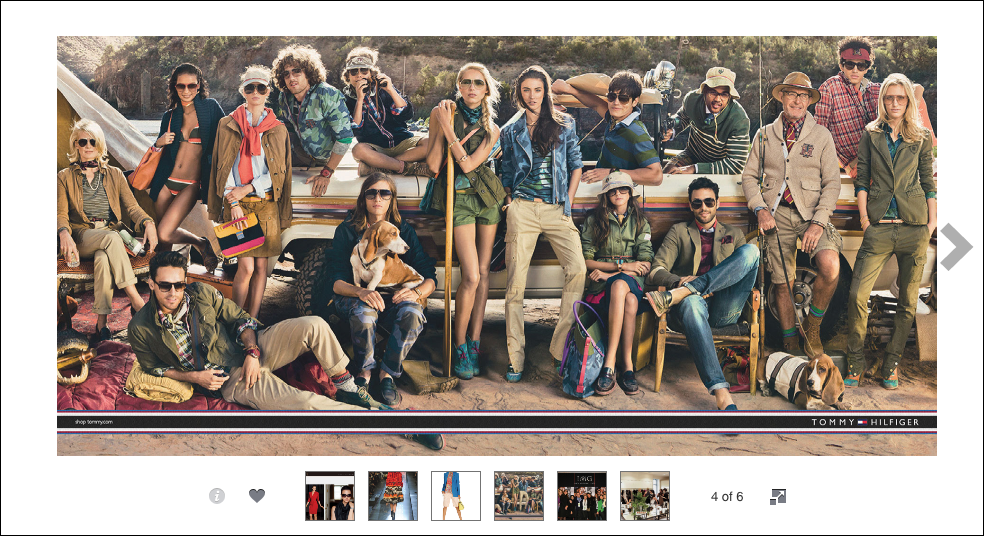
The Gallery tool is optimal for:- Displaying a series of photos, one-by-one, in a lightbox with navigation buttons. This works particularly well when gallery images are displayed in smaller sizes but can be clicked to expand larger versions of the images.
- Displaying single full-sized images, one at a time. This option works well when the intention is for viewers to right-click and download single images, such as for an image library.
Gallery images don’t have clickable links. You may want to display the gallery as images that are large enough to view clearly and do not need to be expanded to larger sizes.
Gallery tools can be used as shortcodes in other tools. For example, you could insert a gallery shortcode into a tab in the Tabs tool, or in an item in the Accordion tool to show a collection of images on a particular tab or in an expanded accordion item.
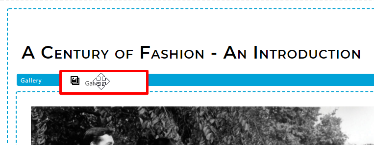
TO ADD A GALLERY TO YOUR LESSON
To add a gallery to your lesson page, you may drag the GALLERY option and drop it to the desired location on your lesson page: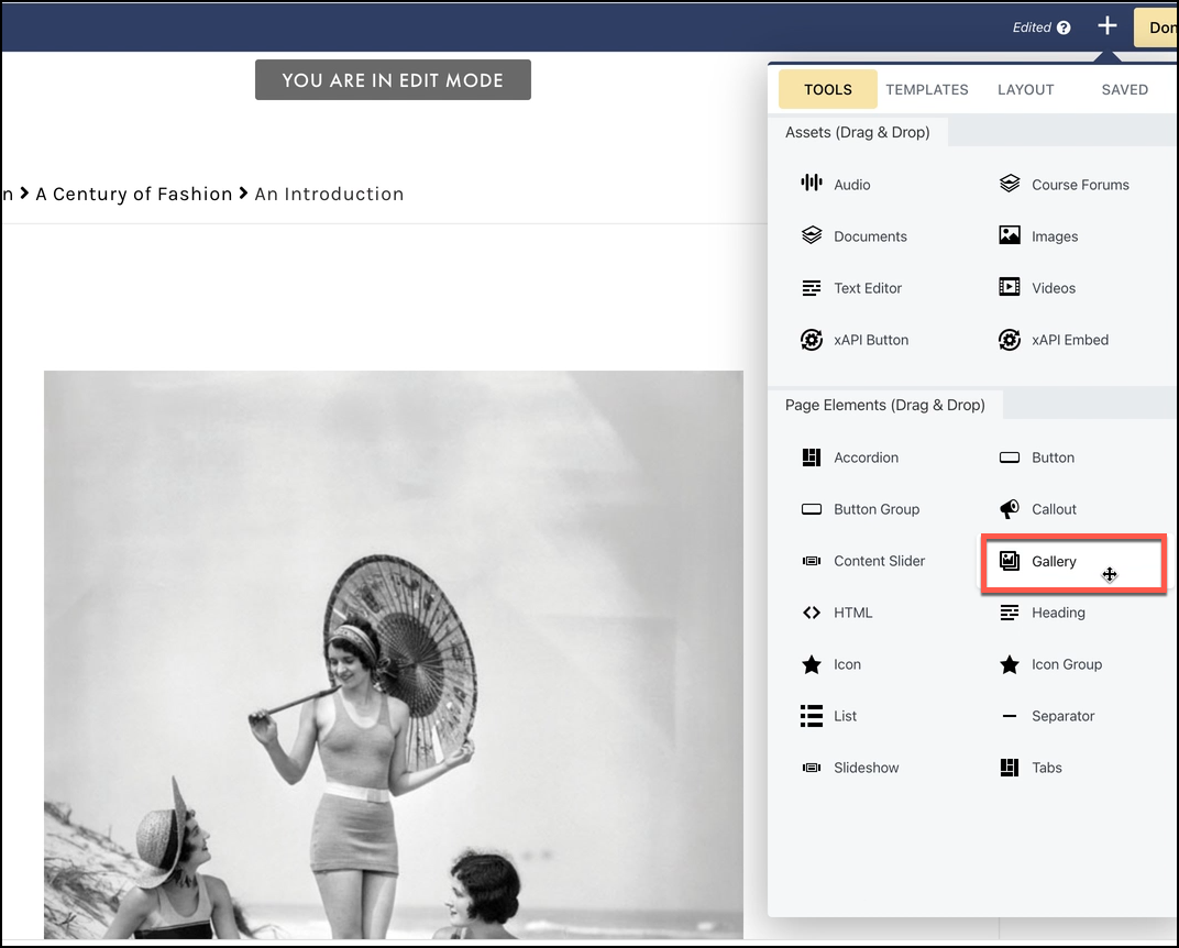
- General
- Style
- Advanced
GENERAL TAB
From the General tab lets you add images to your gallery and customize your settings: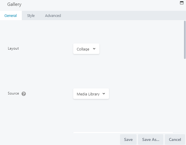
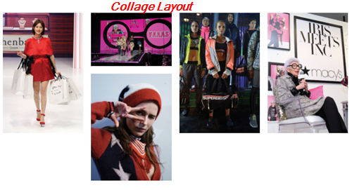
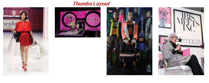
- Layout: Select from Collage, which displays a collage of images at medium size, or Thumbs, which displays thumbnails in a grid. Below is an example of each respective layout:
- Source: Select MEDIA LIBRARY to add images from your Images library, or select SmugMug to add an RSS Feed URL. For SMUGMUG, see the instructions below.
- Photos: If you have selected to add images from the Media Library, click ADD PHOTOS from the Photos field to select your images, then click ADD TO GALLERY. From the Edit Gallery window, you can drag and drop to reorder your images, or click REVERSE ORDER:
Click UPDATE GALLERY once you have selected your images. If you have selected SmugMug as your source, use the FEED URL field to add your URL instead.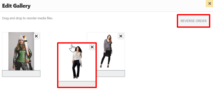
SmugMug is a community-based photo repository site.
- Photo Size: This field appears for Collage layouts only. Select from Small, Medium, or Large.. (If using the Thumbs layout, your thumbnails will display in either the default 150×150 image size or any custom size you’ve set.)
- Show Captions: If you select to show captions, image captions will be pulled from the Media Library or fromSmugMug. By default, longer captions are cut off with elliptical periods.
- Click action: Define what action should happen when images are clicked. You can select from the following options:
- None: No action.
- Lightbox: Opens images in a lightbox with PREVIOUS and NEXT arrows. When selecting this option, set the Lightbox Photo Size based on the largest device size you wish users to use.
- Photo Link: Uses the image URLs to open expanded, large-sized versions of your images, with no theme or formatting, and no navigation links to ther images in your gallery. By default, the Large size in WordPress offers a max height and width of 1024px (or the full size of the image, if you uploaded one less than 1024px)
USE A SMUGMUG GALLERY
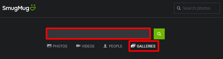
- From the SmugMug website (https://www.smugmug.com/), use the search bar to search for a gallery:
- From your search results, navigate to the SmugMug gallery you want to use.
- Scroll down to the bottom of the gallery page, click the Feed icon, then select RSS:
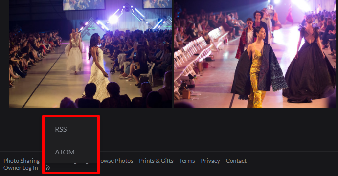
- Copy the RSS link and paste it into the FEED URL field on the General tab of your gallery in C4EBridge.
STYLE TAB
When adding a gallery to your lesson page, you may use the Style tab to adjust your photo spacing and border: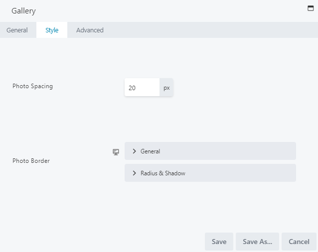
- Photo Spacing: Adjust photo spacing, which is the horizontal and vertical spacing between images, in pixels.
- Photo Border: Set a photo border and adjust its style, color, and width, as well as its radius and shadow.
ADVANCED TAB
When adding a page element, the Advanced tab has the following options: Spacing, Visibility, Animation, HTML Elements, and Export/Import: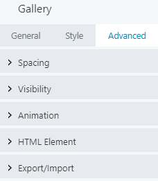
When uploading most assets, the Advanced tab will remain the same. To learn more about the advanced options, visit the Advanced Tab section.
SAVE OR SAVE AS
Once your changes are complete, click SAVE to save your changes and add the gallery to your lesson page or CANCEL to close without saving. You may also use the SAVE AS button to save the gallery as a template (either global or not), to be reused in another lesson or course.See the Save As a Row, Column, or Tool for Reuse section for more information.
SLIDESHOW
- Select images from your Images library or from SmugMug
- Easily change and customize transitions between images, offering a fun and interactive way to break up your lesson text
- Set and customize your navigation and play/pause controls
- Display your image captions
- Set click action links, linking to social media or other sites
- General
- Playback
- Controls
- Advanced
GENERAL TAB
From the General tab, you can adjust the separator color, height, width, alignment, and style: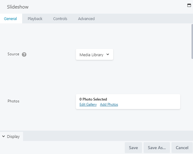
- Source: Select MEDIA LIBRARY to add images from your Images library, or select SmugMug to add an RSS Feed URL. For SmugMug, see the instructions below.
- Photos: If you have selected to add images from the Media Library, click ADD PHOTOS from the Photos field to select your images, then click ADD TO GALLERY. From the Edit Gallery window, you can drag and drop to reorder your images or click REVERSE ORDER
Click UPDATE GALLERY once you have selected your images. If you have selected SmugMug as your source, use the FEED URL field to add your URL instead.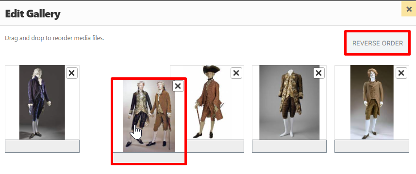
SmugMug is a photo repository site. To learn more about using a SmugMug RSS Feed, visit the Use a Smug Mug Gallery section.
- Display: Use this pane to set a display height, skin color, crop, or disable right-click:
- Height: Set the height of the box in which slideshow images and controls are displayed. The default height is 500px. Individual image size is adjusted to maintain this height.
- Skin Color: Set a color for your slideshow skin. If you have light-colored images and background, select LIGHT. If you have dark-colored images and background, select DARK.
- Crop: Since the Height setting keeps the height of each image constant, the Crop setting determines whether the width of your images should adjust to display the full image OR expand to the full width of the column (minus margin and padding) and crop the left and right edges if necessary.
- Disable Right-Click: Set to YES by default, this setting does not allow users to download the slideshow images.
- Click Action: Define what action should happen when images are clicked. Set to NONE by default, you can select LINK to add a URL in the LINK URL field that will serve as a single destination for the entire set of images. (Separate links cannot be set for individual images.)
PLAYBACK TAB
The Playback tab lets you adjust autoplay, set the speed in which your images display, select a transition, and a transition speed: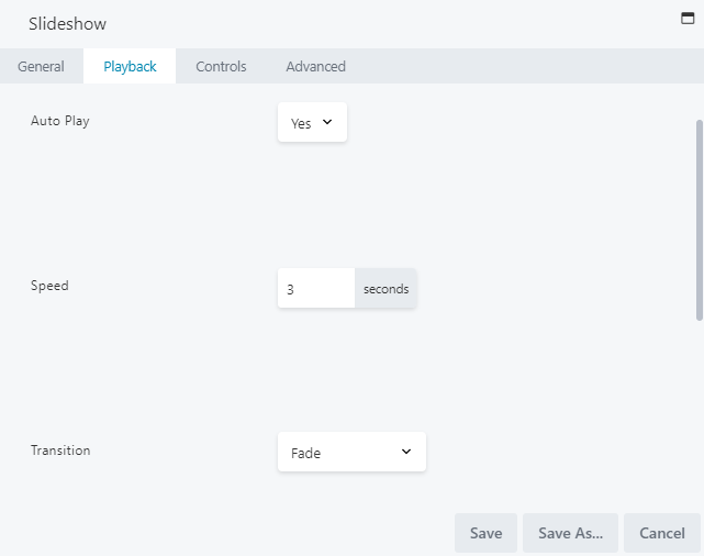
- Auto Play: Set to YES by default, autoplay automatically plays and transitions your images (users can still use any navigation controls to override autoplay). If Auto Play is disabled, users must use the navigation controls to advance through the images.
- Speed: Set the number of seconds in which your images should be displayed. The default is 3 seconds.
- Transition: Set to FADE by default, you may select from a variety of transition effects to be played when moving from one image to the next. You may select from the following options:
- None: The next image is displayed immediately with no transition effect.
- Fade: Image gradually loses opacity as the next slide comes into view.
- Ken Burns: Adds panning and zooming during the display and transition of a slide.
- Slide Horizontal: Typical horizontal movement from right to left.
- Slide Vertical: Current slide moves upwards, followed by the next slide. There is no white space between the current and next slides.
- Blinds: Vertical bands of white space appear over the displayed image and become narrower until the next image is displayed.
- Bars: The next image appears with an overlay of nearly transparent gray bars with a fade transition. This effect works best for short transition times. This effect most resembles the fade transition, which may be a better option for longer transitions.
- Random Bars: Vertical light gray bars of random width and spacing overlay the next image and fade out.
- Boxes: The next image appears with an overlay of nearly transparent gray squares with a fade transition.
- Random Boxes: Random gray rectangles overlay the next image and fade out.
- Boxes Grow: The next image appears with a gray grid overlay that shrinks and disappears.
- Transition Speed: Set the number of seconds spent transitioning to the next image. The default transition speed is three seconds.
- Randomize Photos: Set to No by default, which means photos are displayed in the same order as they appear in the gallery. Select Yes if you wish to randomize your images (the randomization order stays the same with autoplay loops and navigation).
CONTROLS TAB
The Controls tab lets you enable navigation arrows and adjust the Nav Type settings:- Navigation Arrows: To allow for navigation buttons to appear on your slideshow, set to YES to allow users to move through the slideshow manually if they wish.
- Control Bar > Nav Type: Select from:
- None: Hides the control bar from appearing beneath the slide images.
- Buttons: Displays navigation buttons (like previous/next/play/pause buttons) as icons on the control bar beneath each image.
- Thumbs: Displays gallery thumbnails instead of navigation buttons, allowing users to select a different thumbnail and move to that image in the slideshow. By default, the size of thumbnail images is 50px, which can be adjusted in the Thumbs Size field on the Controls tab.
- Control Bar > Nav Position: Defines the position of the control bar. By default, the control bar is set to BOTTOM and appears beneath images. Select TOP if you want the control bar to appear above images.
- Control Bar Buttons: Define which buttons to display in the control bar by selecting YES or NO for each. For more information, see the next section.
- Control Bar Overlay > Overlay Enabled: Set to NO by default. Set to YES to display the control bar in an overlay at the bottom or top of your image slides (it will be placed in a narrow semitransparent band along the inside bottom or top of the slides themselves). If set to YES, you will also need to adjust the following settings:
- Overlay Hide: Set to YES by default, this hides the overlay after the defined number of seconds in the Overlay Hide Delay field have passed. If set to NO, the control bar overlay is always visible.
- Overlay Hide Delay: Set the number of seconds that must pass before the overlay is hidden.
- Thumbs > Thumbs Size: Set the size for your thumbnail images. By default, this is set to 50px.
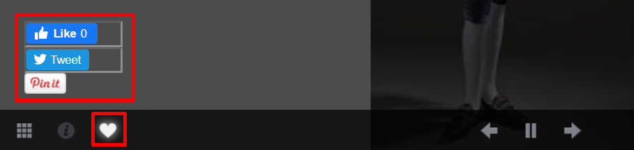
- Social: Define which social media buttons to display on your slideshow.
Control Bar Buttons
When defining which buttons to allow on the slideshow control bar, you may select from the following options: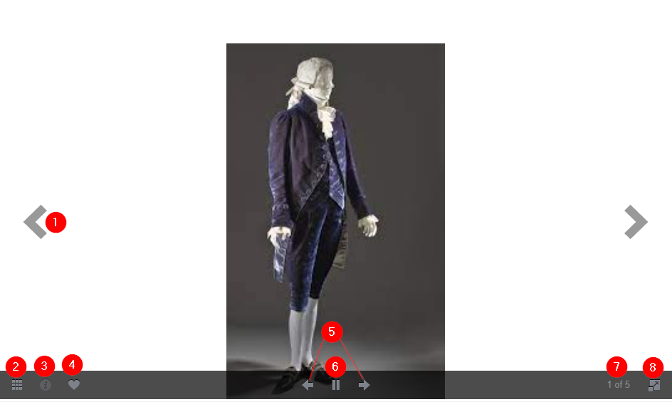
-
- Navigation Arrows: Allows users to move to the previous or next images.
- Thumbs Button: Opens thumbnails of all images in the slideshow, allowing users to select a different image to display:
- Caption Button: Displays any captions that have been uploaded for your images.
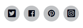
- Social Button: Displays whichever social media buttons you have enabled in the Social section on this tab, allowing users to easily favorite and share images:
- Navigation Arrows (Control Bar): Allows users to move to the previous or next images. The color of the arrows is driven by the Skin Color setting on the General Tab, and whether it is set to LIGHT or DARK. These arrows may appear inside or outside of the images, depending on the image width and the Crop setting on the General tab.
The Navigation Arrows option in the Control Bar Buttons section will appear only when the Control Bar > Nav Type is set to Buttons.
-
- Play/Pause: Allows users to play or pause the slideshow. Enable this setting if you want to give users the option to automate the slide show, even when Auto Play is set to NO on the Playback tab.
The Play/Pause icon is only visible in the control bar when the Play setting is set to Yes, and the Control Bar > Nav Type is set to Buttons.
- Photo Count: Allows users to see the current photo position/total number of images in your slideshow.
- Fullscreen: Lets users toggle to fullscreen mode.
ADVANCED TAB
When adding a page element, the Advanced tab has the following options: Spacing, Visibility, Animation, HTML Elements, and Export/Import: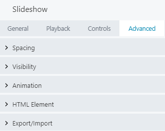
When uploading most assets, the Advanced tab will remain the same. To learn more about the advanced options, visit the Advanced Tab section.
SAVE OR SAVE AS
Once your changes are complete, click SAVE to save your changes and add the slideshow to your lesson page or CANCEL to close without saving. You may also use the SAVE AS button to save the slideshow as a template (either global or not), to be reused in another lesson or course.See the Save As a Row, Column, or Tool for Reuse section for more information.
To learn more about other page element tools that display sets of images with automatic transitions or navigation controls (or both), visit the Gallery and Content Slider sections in this article.
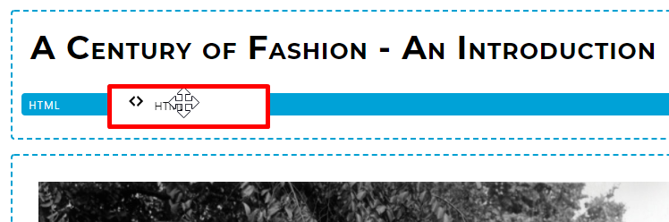
HTML
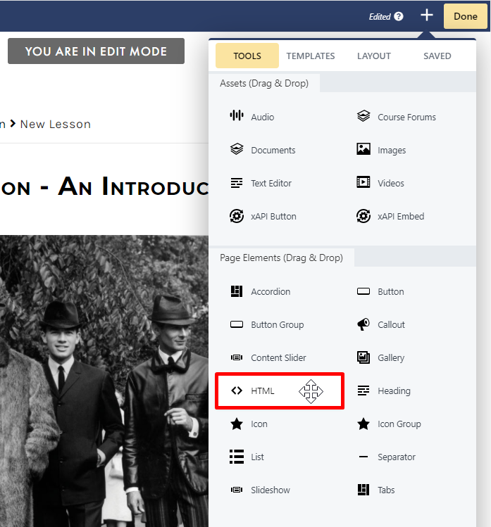
- General
- Advanced
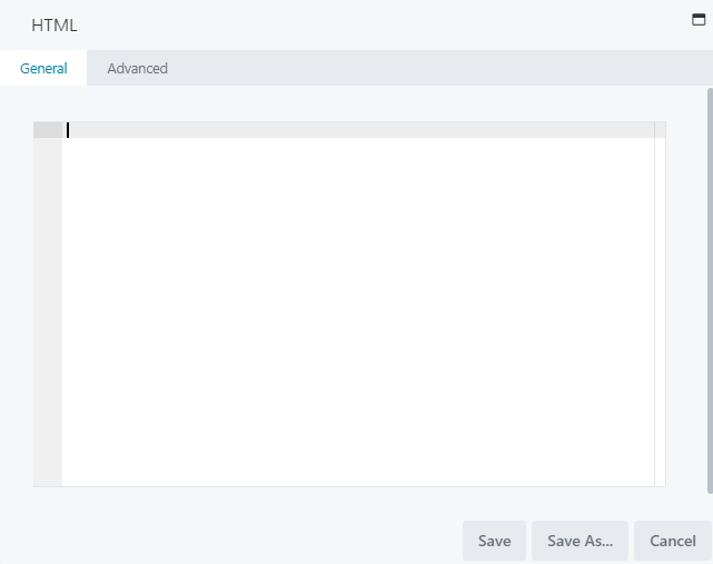
GENERAL TAB
The General tab features a code editor in which to add and edit your HTML code. To style your markup in this module, you can:- Apply inline styles in the code editor
- Apply CSS rules by adding a custom ID or class, either directly in the code editor or in the HTML section of the Advanced tab.
ADVANCED TAB
When adding a page element, the Advanced tab has the following options: Spacing, Visibility, Animation, HTML Elements, and Export/Import: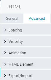
When uploading most assets, the Advanced tab will remain the same. To learn more about the advanced options, visit the Advanced Tab section.
SAVE OR SAVE AS
Once your changes are complete, click SAVE to save your changes and add the HTML module to your lesson page or CANCEL to close without saving. You may also use the SAVE AS button to save the HTML page element as a template (either global or not), to be reused in another lesson or course.See the Save As a Row, Column, or Tool for Reuse section for more information.
ICON AND ICON GROUP
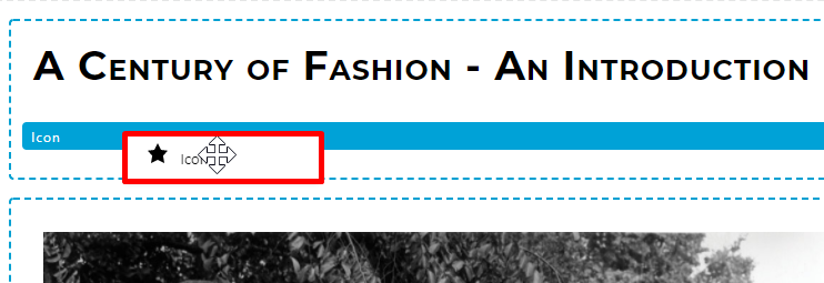
TO ADD AN ICON TO YOUR LESSON
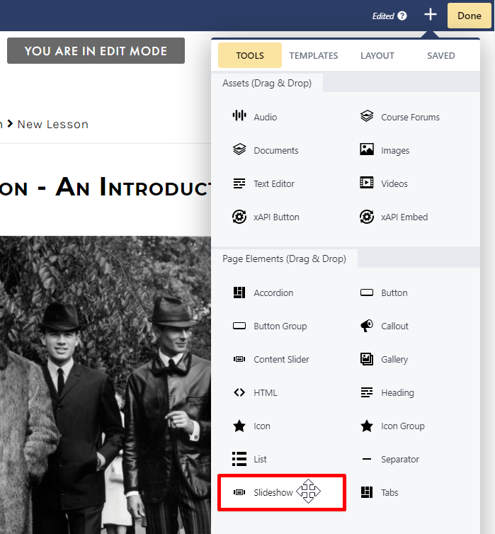
To add an icon to your lesson page, you may drag the ICON option and drop it to the desired location on your lesson page: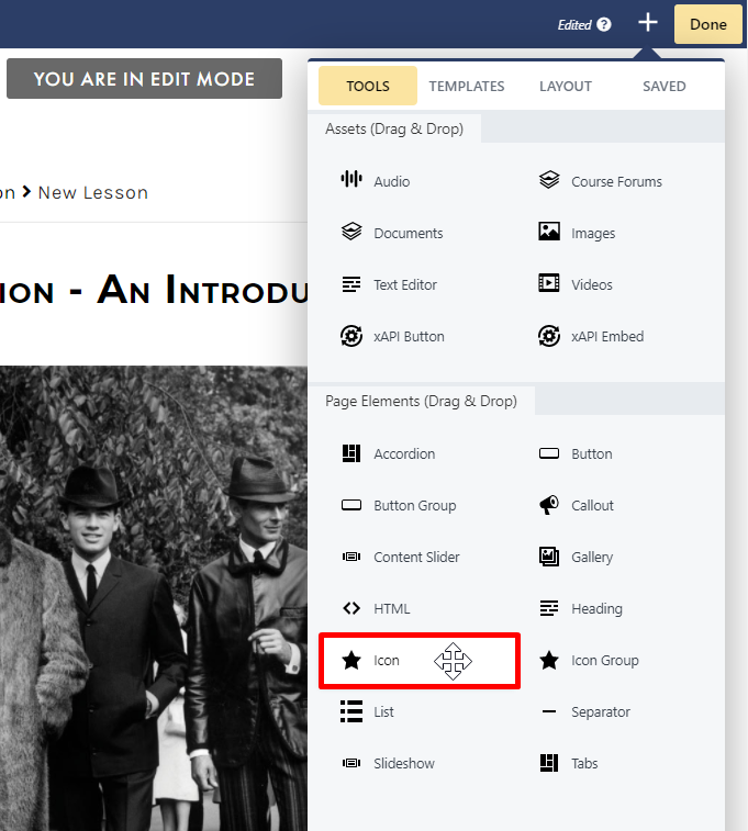
- General
- Style
- Advanced
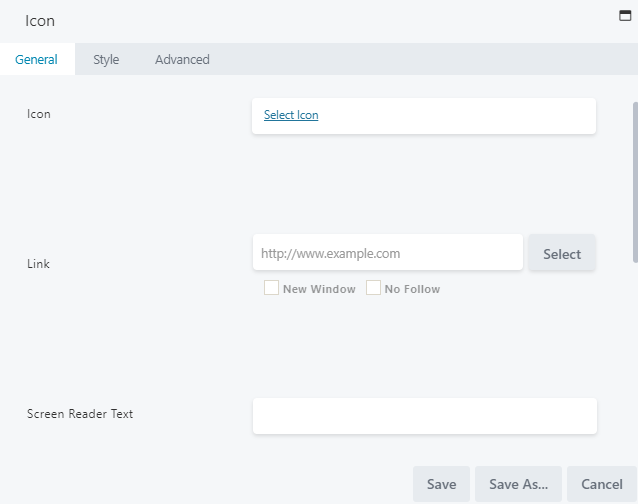
GENERAL TAB
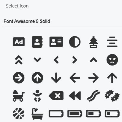
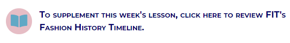
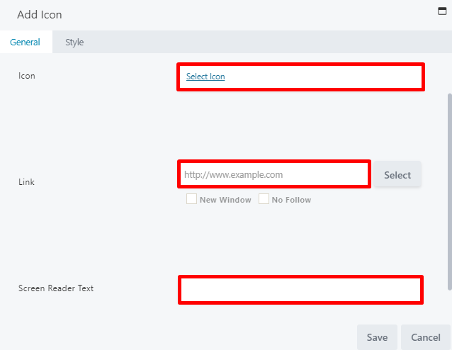
The General tab, you can select your icon, set your link, add screen reader text, and add text to appear to the right of the icon:- Icon: Click SELECT ICON and choose an icon from the library:
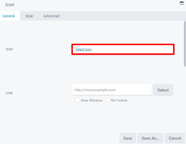
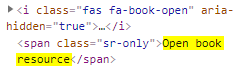
- Screen Reader Text: Enter text to appear in the HTML output to ensure accessibility for users utilizing screen readers. For example, if you select the Font Awesome open book icon and add Open book resource in the Add Screen Reader Text field, the HTML output appears as follows:
- Text: Use the text editor to add any text to appear to the right of your icon.
STYLE TAB
From the Style tab, you can adjust the icon and text style settings: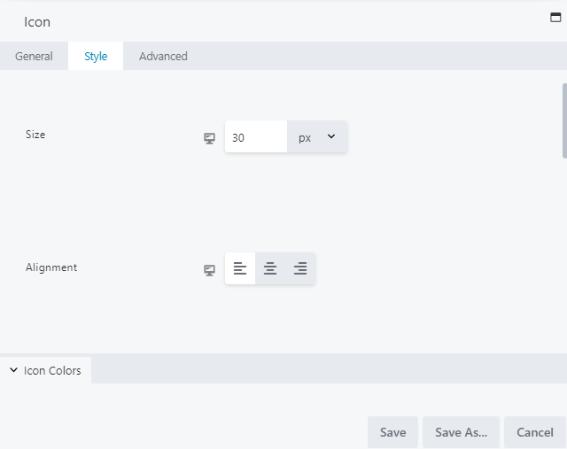
- Icon > Icon Size: Set your icon size. By default, this is set to 30px.
- Icon > Alignment: Select your icon alignment from the standard left, center, or right alignment.
- Icon Colors > Color: Set a color for the icon.
- Icon Colors > Hover Color: Set a color for when hovering over the icon.
- Icon Colors > Background Color: Set a background color for your icon, which will appear as a circle around the icon:
- Icon Colors > Background Hover Color: Set a background color to be displayed for your icon when hovering.
- Text > Text Spacing: Set the spacing for your icon text.
- Text > Text Color: Set the color for your icon text.
- Text > Text Typography: Select a font family, weight, size, line height, alignment, spacing, decoration, style, variant, and text shadow.
ADVANCED TAB
When adding a page element, the Advanced tab has the following options: Spacing, Visibility, Animation, HTML Elements, and Export/Import: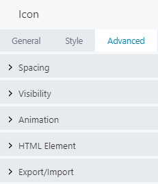
When uploading most assets, the Advanced tab will remain the same. To learn more about the advanced options, visit the Advanced Tab section.
SAVE OR SAVE AS
Once your changes are complete, click SAVE to save your changes and add the icon to your lesson page or CANCEL to close without saving. You may also use the SAVE AS button to save the icon as a template (either global or not), to be reused in another lesson or course.See the Save As a Row, Column, or Tool for Reuse section for more information.
TO ADD AN ICON GROUP TO YOUR LESSON
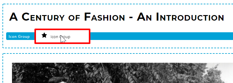
To add an icon to your lesson page, you may drag the ICON GROUP option and drop it to the desired location on your lesson page: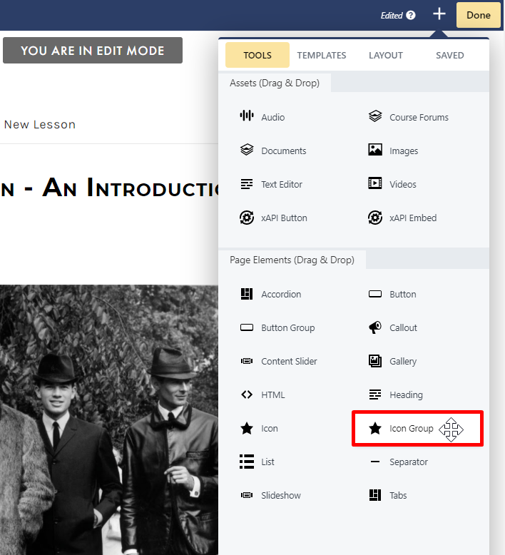
- Icons
- Style
- Advanced
ICONS TAB
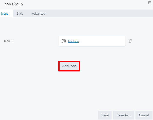
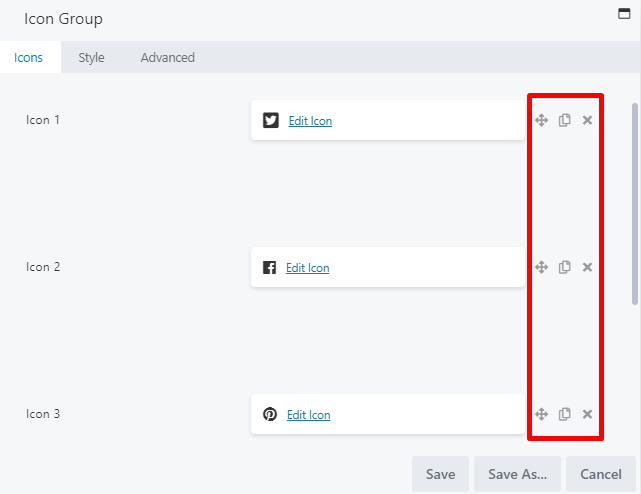
From the Icons tab, you can set and select each icon that will appear in your group. Click EDIT ICON to the right of ICON 1 to define your first icon: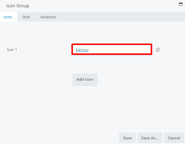
Style settings can be globally adjusted in the general Style tab on the Icon Group window, which will apply to ALL icons in the group. However, you may make changes in an individual icon’s Style tab to override any globally set settings.
- Move icons up or down in the list
- Duplicate an icon
- Delete an icon
STYLE TAB (GLOBAL)
The global Style tab on the Icon Group window controls the style settings for ALL icons in the group (unless style settings were adjusted for any individual icons from the Add Icon window, which would override global settings). The global Style tab for the icon group allows you to adjust the icon and text style settings: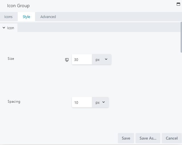
- Icon > Icon Size: Set your size for all icons in your group. By default, this is set to 30px.
- Icon > Alignment: Select your icon alignment from the standard left, center, or right alignment.
- Icon Colors > Color: Set a color for the icons in your group.
- Icon Colors > Hover Color: Set a color for when hovering over the icons.
- Icon Colors > Background Color: Set a background color for your icons, which will appear as circles around the icons:
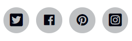
- Icon Colors > Background Hover Color: Set a background color to be displayed for your icons when hovering.
- Icon Colors > Gradient: To set a color gradient (which is lighter on top and darker on the bottom) for your icons, select YES. This is set to NO by default.
ADVANCED TAB
When adding a page element, the Advanced tab has the following options: Spacing, Visibility, Animation, HTML Elements, and Export/Import: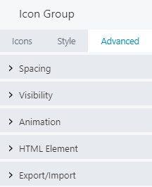
When uploading most assets, the Advanced tab will remain the same. To learn more about the advanced options, visit the Advanced Tab section.
SAVE OR SAVE AS
Once your changes are complete, click SAVE to save your changes and add the icon group to your lesson page or CANCEL to close without saving. You may also use the SAVE AS button to save the icon group as a template (either global or not), to be reused in another lesson or course.See the Save As a Row, Column, or Tool for Reuse section for more information.
LIST
LIST GROUP EXAMPLES
Generic Lists
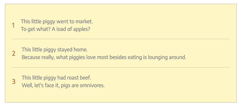
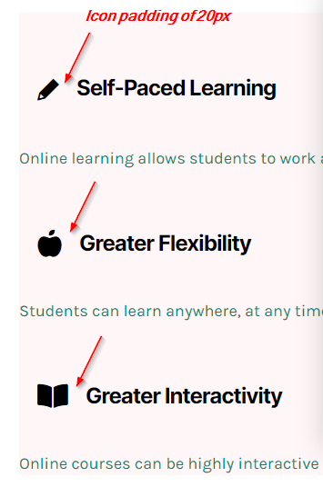
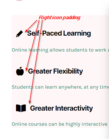
Generic lists let you select icons from the icon library, instead of using standard list markers. They are represented by the <div> tag in the HTML output. Below are some examples of generic lists:- A generic list with a Font Awesome icon (set at 30px) and icon padding (right-adjusted for more room between the icon and the heading):
- A generic list with headings, content, and icons, in which the icons are set to the right of the headings:
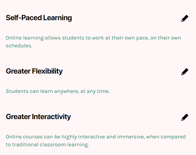
- A generic list with headings, content, and icons, in which the icons are set to the right of the headings:

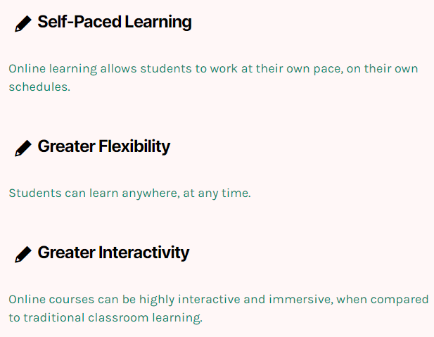
- A generic list with headings and content, but no icons:
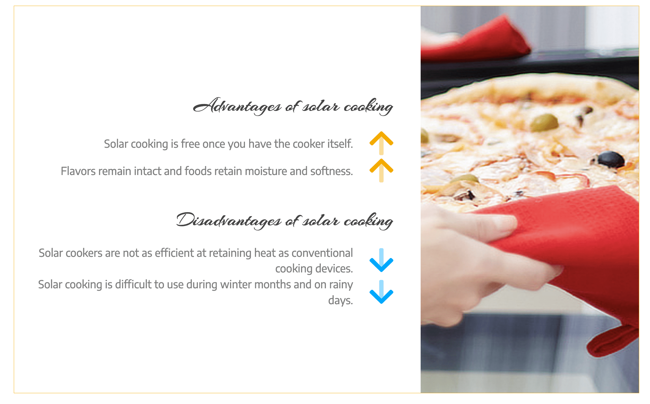
- A generic list that shows two list modules (one for advantages and one for disadvantages), both with content and icons but no headings. The arrow icons are from the Font Awesome set and are displayed to the right of the content. The headings for each list are Heading modules.
When you select markers or icons to the right of the headings or content, they are right-aligned. You can adjust their position by using icon padding.
Unordered Lists
Unordered lists are typical bulleted lists, featuring more limited list markers (or icons) than generic lists. Markers can be selected from the standard circle and square bullets, and can be adjusted in size: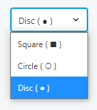
- An unordered list with headings and content, and list markers displayed to the left of headings:
- An unordered list with headings and content, and list markers displayed to the right of markers:
- An unordered list with headings and content, list markers displayed to the left of markers, and item separators added:
Ordered lists
Ordered lists are typical numbered lists with a <ol> tag in the HTML output. When creating an ordered list, you can choose from various ordering notations for the list item markers, such as numeric or alphabetic numerals, or Roman, Hebrew, Armenian, or Greek numerals: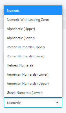
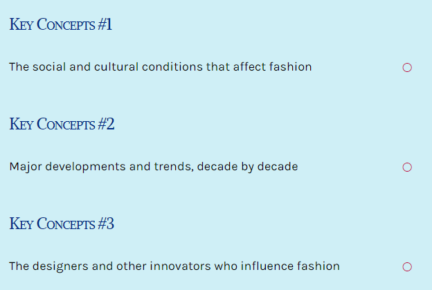
- An ordered list with just headings and markers, no content:
In this example, the list marker is vertically centered (this is the default), and the icon size is increasedThe position of the numerical list marker can be adjusted by adjusting the icon padding setting.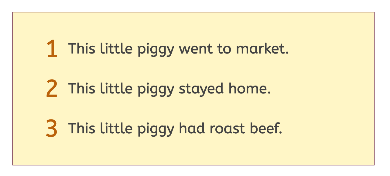
Ordered list markers do not feature a period after the number.
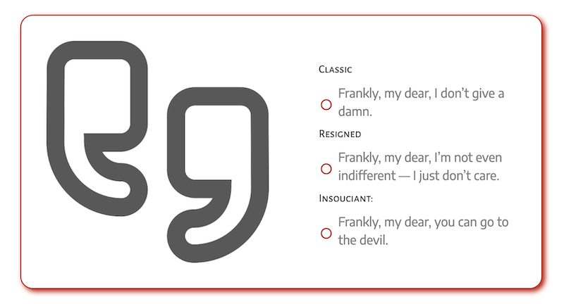
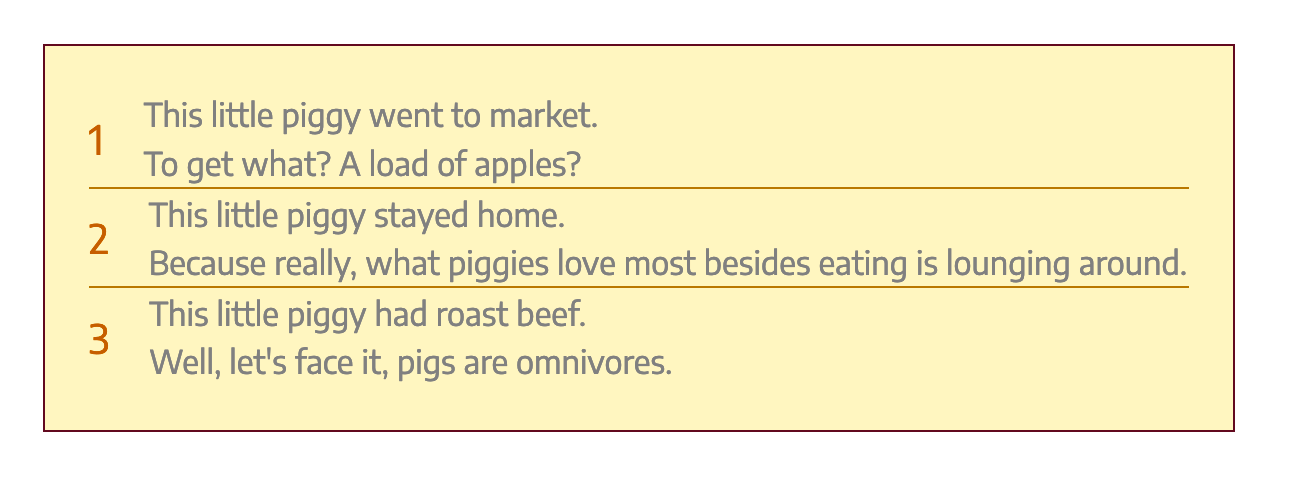
- An ordered list with content only (no headings), plus a separator between items:
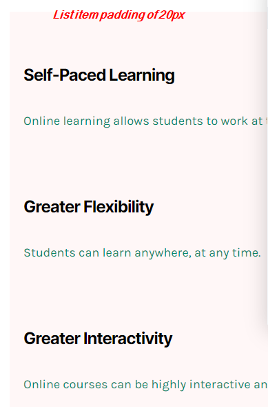
While there is no setting to increase space between list items, you can add a CSS rule by creating a custom class name for your List module (i.e., ‘my-list-padding,’ as in the example below) and then adding the following CSS rule: .my-list-padding li { padding: 20px 0 20px 0; }
The four padding numbers are for the top, right, bottom, and left respectively. Here’s how the ordered list changed with this rule:
TO ADD A LIST TO YOUR LESSON
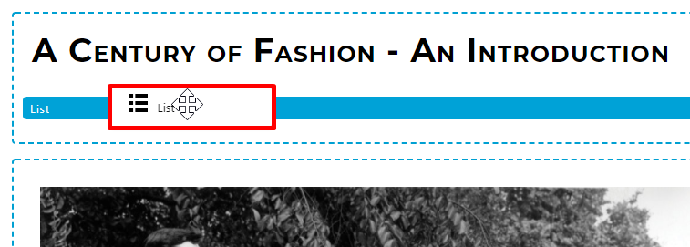
To add a list to your lesson page, you may drag the List option and drop it to the desired location on your lesson page: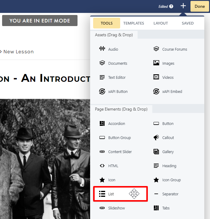
- General
- Style
- Advanced
GENERAL TAB
Display Section
From the Display section on the General tab, you can adjust your list display: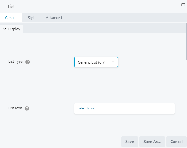
- Display > List Type : Select your desired list type: Generic, Unordered, or Ordered ( as described in the previous section).
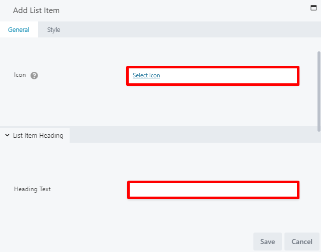
- Display > List Icon : Set an icon to display for all list items. Your options will vary based on which list you select. (If you want different markers for each list item, you may override this when defining your list items.)
- Display > List Icon Placement : Choose where the list item marker will appear from the Left of Heading, Left of Content, Right of Heading, or Right of Content options. Choosing Right of Heading or Right of Content places the list item markers flush with the right margin of the list container. You can fine-tune the positioning of the icons by changing the Icon Width and Icon Padding settings in the Icon style section of the Style tab.
- Display > List Item Heading Tag : Choose the HTML tag that will be used for the list item’s heading. You can choose from <h1> – <h6> or the <span> or <div> tags.
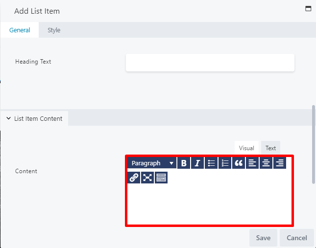
- Display List Item Content Tag : Choose the HTML tag that will be used for the list item’s content. You can choose from the <div>, <aside>, or <section> tags.
- List Items > List Item 1 : Click EDIT LIST ITEM to create your first item.
List Items Section
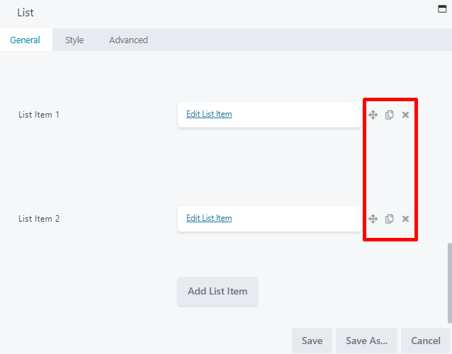
From the List Items section on the General tab, you can define and style your list items. Select EDIT LIST ITEM to the right of List Item 1 to configure your first list item: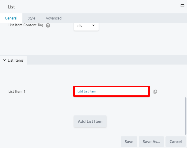
Style settings can be globally adjusted in the general Style tab on the List window, which will apply to ALL list items in the group. However, you may make changes in an individual item’s Style tab to override any globally set settings.
- Move buttons up or down in the list
- Duplicate a button
- Delete a button
STYLE TAB (GLOBAL)
Top Section
The top section lets you choose your list background color, padding, and border: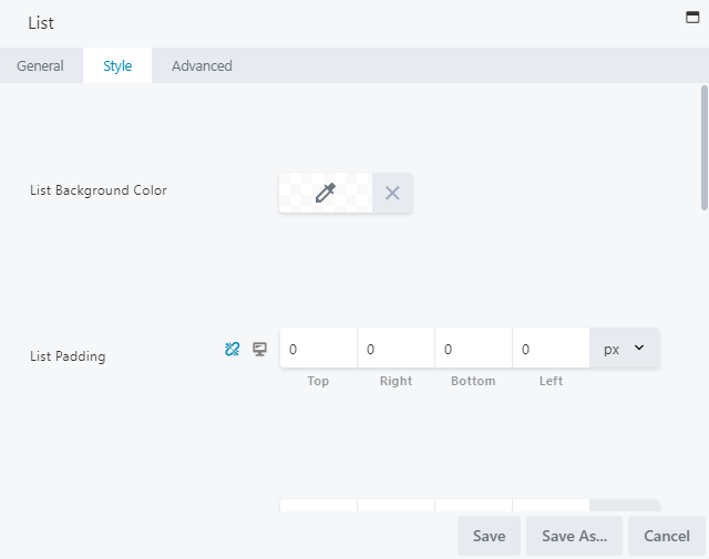
- List Background Color: Select a background color, to be added around the entire list.
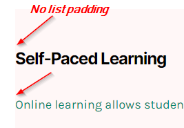
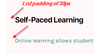
- List Padding (Responsive): Add padding between the list border and the list items (this is especially useful when you’ve set a background color or border):
- List Item Padding (Responsive): Add padding around the list items themselves:
To control padding around individual list items, use the List Item Padding setting on Style tab of the Add List Item window.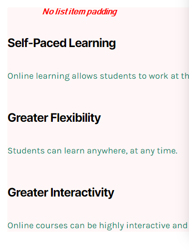
- Border Around List (Responsive): Add a border, radius, or shadow around your list, using standard Lesson Editor border settings.
For responsive settings, click the computer icon to toggle the setting for desktop, tablet, and mobile displays.
Icon Style Section
The Icon Style section sets style settings for the global list icon selected on the General tab (unless style settings were adjusted for any individual list items from the Add List Item window, which would override global settings):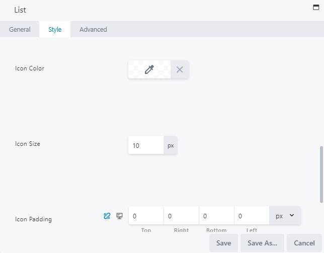
- Icon Color: Select a color for your list item icon.
- Icon Size: Adjust the size of the icon. The default icon size is 30px.
- Icon Padding (Responsive): Increases padding between the icon and icon’s border-box:
If your icons are to the left, increasing the left icon padding indents the line, while increasing the right icon padding increases the space between the icon and the text: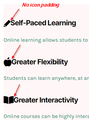
To adjust the vertical position of the icons, tweak the top or bottom padding.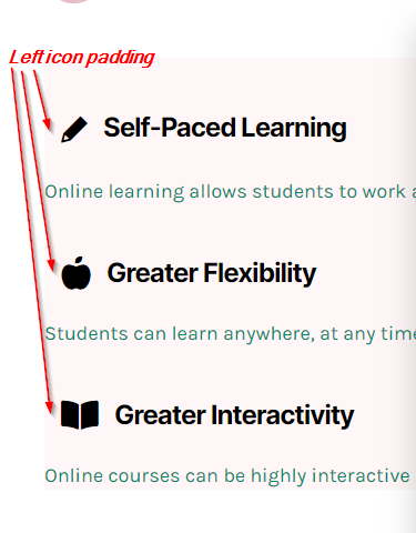
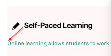
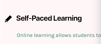
To rectify this, access the list item’s text editor (by going to Edit List Item, then accessing the Content section), and add inline CSS to increase the indent for the content.
Wrap the content with an HTML tag (such as <p>), then add a style attribute and adjust padding pixels to indent your content. For example, you can use: <p style=”padding-left:20px;”>YOUR CONTENT TEXT.</p>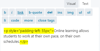 This will better align your content text with the heading:
For responsive settings, click the computer icon to toggle the setting for desktop, tablet, and mobile displays.
Heading Style Section
The Heading Style section on the Style tab lets you adjust your heading color and typography for all list items (unless style settings were adjusted for any individual list items from the Add List Item window, which would override global settings):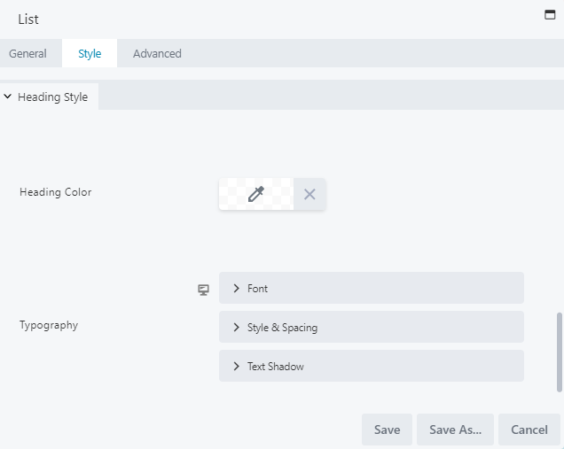
- Heading Color: Set the heading text color for all headings in your list.
- Typography (Responsive): Adjust the font family, weight, size, and alignment for all headings in your list. See the standard Typography section for more information.
For responsive settings, click the computer icon to toggle the setting for desktop, tablet, and mobile displays.
Content Style Section
The Content Style section on the Style tab lets you adjust your content color and typography for all list items (unless style settings were adjusted for any individual list items from the Add List Item window, which would override global settings):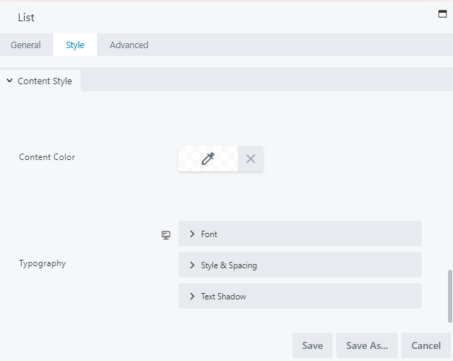
- Content Color: Select the content color for all content in your list.
- Typography (Responsive): Adjust the font family, weight, size, and alignment for all content in your list. See the standard Typography section for more information.
For responsive settings, click the computer icon to toggle the setting for desktop, tablet, and mobile displays.
Item Separator Section
The Item Separator section on the Style tab lets you add a customized separator for all list items: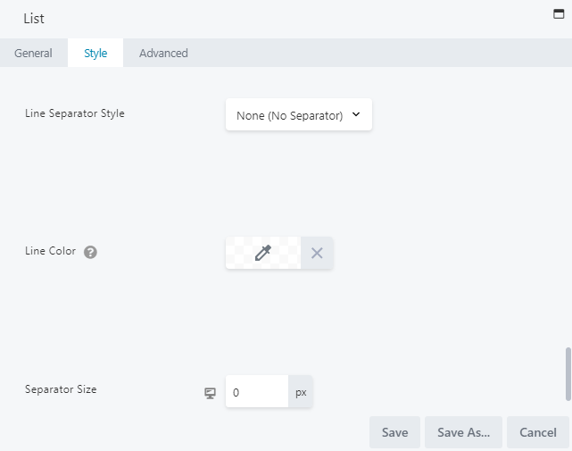
- Item Separator Style: Select a separator style from the None, Solid, Dashed, Dotted, or Double options.
- Line Color: Pick a color for your separator line.
- Separator Size (Responsive): Choose the height of the separator line in pixels.
For responsive settings,click the computer icon to toggle the setting for desktop, tablet, and mobile displays.
ADVANCED TAB
When adding a page element, the Advanced tab has the following options: Spacing, Visibility, Animation, HTML Elements, and Export/Import:
When uploading most assets, the Advanced tab will remain the same. To learn more about the advanced options, visit the Advanced Tab section.
SAVE OR SAVE AS
Once your changes are complete, click SAVE to save your changes and add the button group to your lesson page or CANCEL to close without saving. You may also use the SAVE AS button to save the button group as a template (either global or not), to be reused in another lesson or course.See the Save As a Row, Column, or Tool for Reuse section for more information.
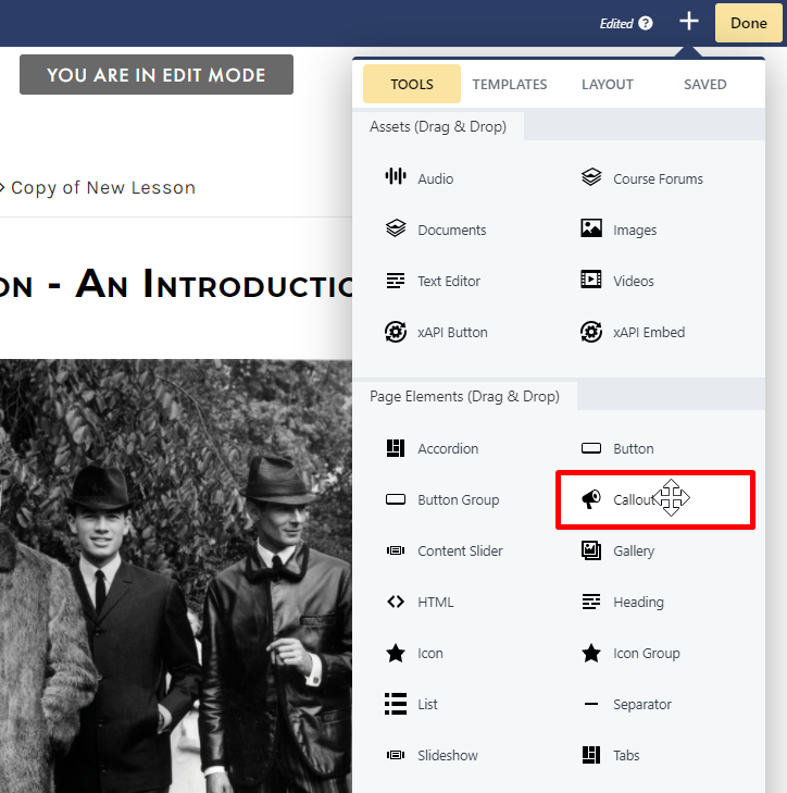
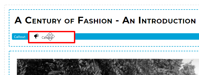
CALLOUT
- General
- Style
- Image
- Link
- Advanced
GENERAL TAB
From the General tab, you can add your callout heading and content text: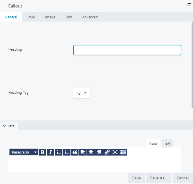
- Heading: Enter a heading for your callout.
- Heading Tag: Select a heading tag. By default, this is set to h3.
- Text: In the text editor, add your content text for the callout page element.
STYLE TAB
You may use the Style tab to adjust the style settings for your callout:Top Section
The top section allows you to choose the item size, item spacing, and item border: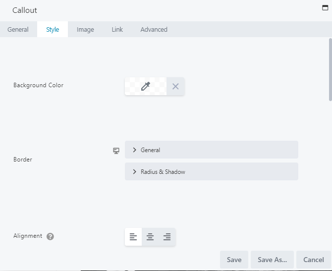
- Background Color: Select a background color for your callout.
- Border: Select your general border settings (style, color and width), as well as its radius and shadow.
- Alignment: Select your alignment from the standard left, center, or right alignment.
- Padding: Set a specific padding value for your callout in pixels.
- Heading > Heading Color: Select a color for the heading in your callout.
- Heading > Heading Typography: Select a font family, weight, size, line height, alignment, spacing, decoration, style, variant, and text shadow for the heading in your callout.
- Text > Text Color: Select a text color for the content in your callout.
- Text > Text Typography: Select a font family, weight, size, line height, alignment, spacing, decoration, style, variant, and text shadow for content in your callout.
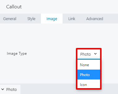
IMAGE TAB
Use the Image tab to add an icon or photo to your callout: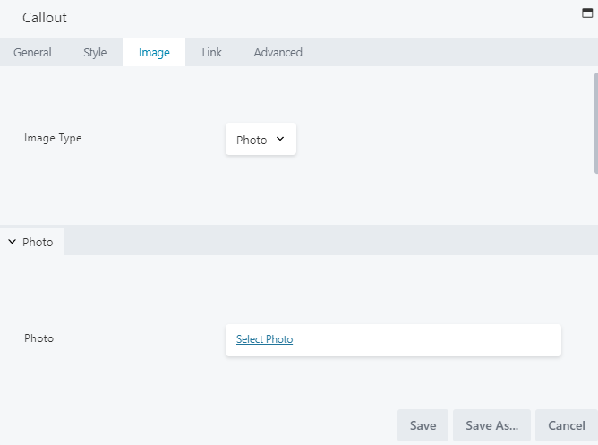
- Photo > Photo: Click SELECT PHOTO to choose a photo from your Images library.
- Photo > Position: Choose where to position your photo: Above Heading, Below Heading, Left of Text and Heading, Right of Text and Heading.
- Photo Style > Crop: Choose how to crop your photo: None, Landscape, Panorama, Portrait, Square, Circle.
- Photo Style > Width: Select a width for your photo.
- Photo Style > Align: Select to align your photo from the standard left, center, or right alignment.
- Photo Style > Border: Select your general border settings (style, color and width) for your photo, and adjust its radius and shadow.
- Icon > Icon: Click Select Icon to choose an icon from the icon library.
- Icon > Screen Reader Text: Enter text describing your selected icon. This will appear in the HTML output to ensure accessibility for users utilizing screen readers.
- Icon > Position: Choose where to position your icon: Above Heading, Below Heading, Left of Text and Heading, Right of Text and Heading.
- Icon Colors > Color: Select a color for your icon.
- Icon Colors > Hover Color: Select a color to appear when hovering over the icon.
- Icon Colors > Background Color: Set a background color for your icon, which will appear as a circle around the icon.
- Icon Colors > Background Hover Color: Set a background color to be displayed for your icon when hovering.
- Icon Colors > Gradient: To set a color gradient (which is lighter on top and darker on the bottom) for your icon, select Yes. This is set to No by default.
- Icon Structure > Size: Set your icon size. By default, this is set to 30px.
LINK TAB
Use the Link tab to add a URL and call to action for the photo or icon in your callout: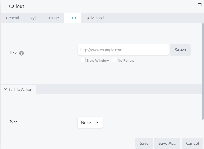
- Link: Enter the URL you want the photo/icon to navigate to.
- Call to Action > Type: Select from None, Link, or Button.
- If selecting Link, the following options are available:
- Call to Action > Text: Enter any text you want displayed for this link. The default text is: READ MORE.
- Link Text > Link Color: Select a color for your link.
- Link Text > Link Hover Color: Select a color for when hovering over your link.
- Link Text > Link Typography: Select the font family, weight, size, and alignment for your link text.
- If selecting Button, the following options are available:
- Button Icon > Button Icon: Click SELECT ICON to choose an icon from the icon library.
- Button Style > Button Width: Select your button width, from Auto or Full Width.
- Button Style > Button Align: Select your button alignment from the standard left, center, or right alignment.
- Button Style> Button Padding: Set a specific padding value for your button in pixels.
- Button Text > Button Text Color: Set the color for your button text.
- Button Text > Button Text Hover Color: Set a color to be displayed for your button text when hovering.
- Button Text > Button Typography: Select a font family, weight, size, line height, alignment, spacing, decoration, style, variant, and text shadow for your button.
- Button Background > Button Background Color: Set a background color for your button.
- Button Background > Button Background Hover Color: Set a background color for when hovering over your button.
- Button Background > Button Background Style: Choose from a flat or gradient (which is lighter on top and darker on the bottom) button style.
- Button Border > Button Border: Select your general border settings (style, color and width) for your button, and adjust its radius and shadow.
- Button Border > Button Border Hover Color: Set a border color for when hovering over your button.
- If selecting Link, the following options are available:
ADVANCED TAB
When adding a page element, the Advanced tab has the following options: Spacing, Visibility, Animation, HTML Elements, and Export/Import: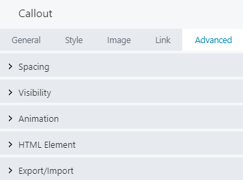
When uploading most assets, the Advanced tab will remain the same. To learn more about the advanced options, visit the Advanced Tab section.
SAVE OR SAVE AS
Once your changes are complete, click SAVE to save your changes and add the icon to your lesson page or CANCEL to close without saving. You may also use the SAVE AS button to save the icon as a template (either global or not), to be reused in another lesson or course.See the Save As a Row, Column, or Tool for Reuse section for more information.