Tutorials
- USER GUIDES & VIDEO TUTORIALS
- ALL VIDEO TUTORIALS
- OVERVIEW
- ASSETS
- CREATE COURSE
- Getting Started with Creating Courses
- Create Course - Course Settings
- Course Builder (TOC)
- Build Lessons
- Tool Settings
- Advanced Tab – An Overview
- Typography
- Borders
- Style and Spacing
- Colors
- Advanced Techniques
- Responsive Design
- Move or Resize Settings Panel
- Row Effects
- MANAGE COURSES
- MANAGE TEMPLATES
- MANAGE XAPI
- ADMIN
- ACCOUNT
Typography
Table of Contents
TYPOGRAPHY
Many of the tools that allow text all feature a standard Typography section, allowing you to select the font family, weight, size, and alignment for your text:
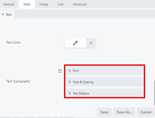
- Font
- Style & Spacing
- Text Shadow
FONT SECTION
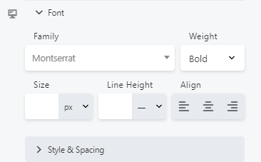
From the Font subsection, you may select a font family, weight, size, line height, and alignment:
-
- Family: Select a font family from a system font or any Google font.
- Weight: Adjust the font weight to make your font thinner or bolder. When a system font is selected for the Family field, you can select from Light, Normal, or Bold weights. When a Google font has been selected, the Weight field lists all styles included with that font. For example, the Google Cabin font includes Normal, Medium, Semi-Bold, and Bold weights. The Google italic forms of the font family can be selected in the Style field of the Style & Spacing subsection. If you select a custom web font for the Family field, the weight choices are limited to the weights you configured for your font.
- Size: Type or use the slider to select your font size. You may choose to use px, em, rem, or vw as the preferred unit of measurement. If this field is left empty, the default setting is used.
- Line Height: Type or use the slider to set the amount of space used for lines of text. Specify a number value and a unit of measurement. The dash value in the units dropdown indicates a unitless value and means the number value is multiplied by the element’s font size. In most cases, this is the preferred way to set line height, but you may also choose px or em. If this field is left empty, the default line-height is used.
- Align: Set your preferred text alignment. You may select from the standard left, center, or right align. If no alignment choice is selected, the default alignment will be used.
 To learn more about alignment, CSS, Length, Height, Size, or Units, visit the Alignment Style & Spacing Section.
-
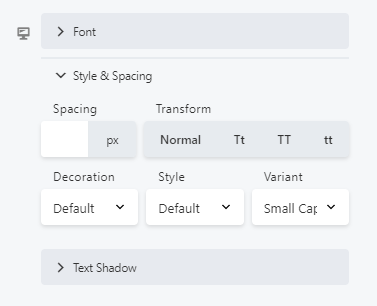
- Spacing: Type or use the slider to control the amount of horizontal spacing between words, in pixels.
- Transform: Change the case of the text string without retyping. This corresponds to the CSS text-transform property. You may select from:
- Normal: Text appears as typed.
- Tt: The first letter of every word is capitalized.
- TT: All letters are converted to uppercase and are a uniform size.
- tt: All letters are converted to lowercase.
- Decoration: Set a decoration for your text. You may select from:
- Default: Uses whatever text decoration is already set in the CSS for this element.
- None: Removes/overrides any default text decoration.
- Underline: Adds an underline to your text.
- Overline: Adds an overline to your text.
- Line Through: Adds a line through your text.
- Style: Set your italic or oblique settings. This setting corresponds to the font-style property and offers the following options:
- Default: Uses whatever style settings are inherited.
- Normal: Font is not italicized or oblique, but regular/upright.
- Italic: Itacizes the font.
- Oblique: Sets an oblique style.
 When setting the style to italic, the system will load the italic version of the font family you selected, if one exists. If not, the browser provides a computer-generated italic version of that font.
- Variant: Set a variant for your font. You may select from:
- Default: Uses whatever variant settings are inherited.
- Normal: Font is regular/upright, overriding any inherited variant setting.
- Small Caps: Capitalizes all letters, but uses larger letters for those that are capitalized in the original text. (Conversely, the Uppercase option on the Transform list capitalizes all letters to a uniformly equal height.)
TEXT SHADOW SECTION
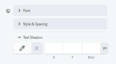
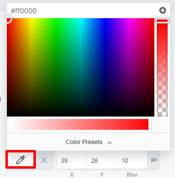
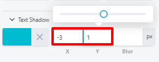
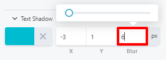
From the Text Shadow subsection, you may set a text shadow, which adds a shadow behind the text. You may also control the shadow color, direction of offset, and blur:


TYPOGRAPHY SETTINGS AND DEVICE SIZE
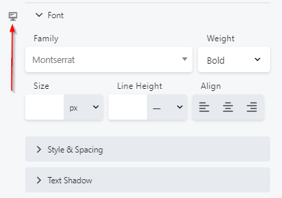
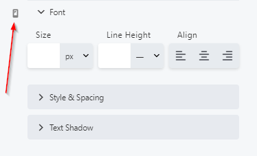
From the Typography section, you can also define your text typography for different devices using the device icon: