Tutorials
- USER GUIDES & VIDEO TUTORIALS
- ALL VIDEO TUTORIALS
- OVERVIEW
- ASSETS
- CREATE COURSE
- Getting Started with Creating Courses
- Create Course - Course Settings
- Course Builder (TOC)
- Build Lessons
- Tool Settings
- Row Effects
- MANAGE COURSES
- MANAGE TEMPLATES
- MANAGE XAPI
- ADMIN
- ACCOUNT
Ideas for Using Background Colors & Effects
IDEAS FOR USING BACKGROUND COLORS & EFFECTS
 All of these colors and effects except shape overlays are also available for column backgrounds. Background color and border effects are available in specific tools.
SOLID COLOR
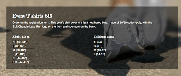
The most basic row or column background is a solid color. Here’s an example of a dark row background behind a Callout element.

Here are a few ideas for variations of the solid-color row background.
CHANGE THE OPACITY
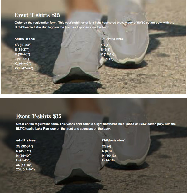
If you’re working with a defined color palette, try changing one of the row or column backgrounds in your palette to a slightly lighter opacity.
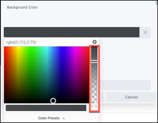
After you select the color box, use the scroll bar on the right to change the opacity.
ADD A GRADIENT

 To learn more about adding gradients view the article on Colors.
ADD A ROW SHAPE OVERLAY
You can add a shape to a row edge that is anchored in relation to the top or bottom border of the row. You can style and transform the shape in various was, such as flipping horizontally and vertically and changing the Y offset, so you can place the shape overlay just about anywhere in the row and give it some interesting effects.
Here’s an example of a concave overlay at the top border with a semi- transparent background color and radial gradient overlay that creates something of a halo effect. The background image is fixed, so the overlay allows the trees to peek through in the halo area as the page is scrolled.

 Also see the article on Shape Overlays.
ADD A BORDER AND/OR BORDER EFFECTS
You can add a border and round the border corners or add a border shadow to any row, column, or tool that has a BORDERS section.
Here’s an example where the border is made a bit more interesting by using 5px on the left and top side and 10px on the right and bottom side.

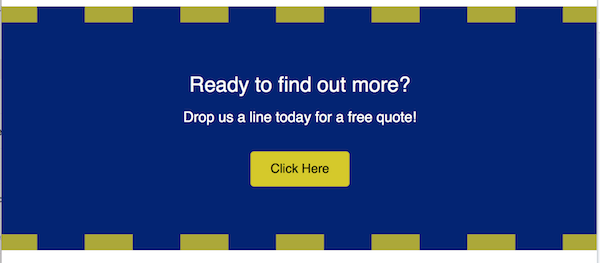
In the following screenshot, a radius and shadow have been added in the same blue color as the row background.

 To learn more, view the article on Borders.
ADD A TEXTURE
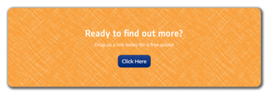
Row backgrounds with both color and texture become even more interesting. The best way to add texture is to use an image for the row background. Choose PHOTO instead of COLOR in the row settings.
Here’s an example of an image with color and texture used as a background. This example has no border, but radius and shadow border effects were also applied to soften the corners.
SET OF CONTENT WITH A BACKGROUND IN A COLUMN OR MODULE
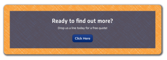
COLOR OVERLAY
